How to create Parallax Scrolling in Android Android 23.04.2017
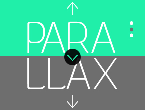
Parallax scrolling is a technique in computer graphics and web design, where background images move by the camera slower than foreground images, creating an illusion of depth in a 2D scene and adding to the immersion.
Before android developed some layouts and widgets like CoordinatorLayout, AppBarLayout, CollapsingToolbarLayout, Toolbar etc it was very difficult to make parallax header view in android because you need to write a lot of code for that
Before we start jumping in and see all types of scrolling behavior, we needs to be clear about the basic setup and implementation. Use Design Support Library to achieve AppBar scrolling behavior. This library provides many of the material design components.
In app build.gradle
dependencies {
    ...
    compile 'com.android.support:design:25.0.1'
    compile 'com.android.support:recyclerview-v7:25.0.1'
    compile 'com.android.support:cardview-v7:25.0.1'
}
Open your app XML layout file and add CoordinatorLayout, AppBarLayout, CollapsingToolbarLayout using design support library and inside CollapsingToolbarLayout add an ImageView for header parallax image and Toolbar for appbar/actionbar. Following is the complete content of XML layout file.
<?xml version="1.0" encoding="utf-8"?>
<android.support.design.widget.CoordinatorLayout
    xmlns:android="http://schemas.android.com/apk/res/android"
    xmlns:app="http://schemas.android.com/apk/res-auto"
    android:id="@+id/coordinatorLayout"
    android:layout_width="match_parent"
    android:layout_height="match_parent">

    <android.support.design.widget.AppBarLayout
        android:id="@+id/appBarLayout"
        android:layout_width="match_parent"
        android:layout_height="200dp"
        android:theme="@style/ThemeOverlay.AppCompat.Dark.ActionBar">

        <android.support.design.widget.CollapsingToolbarLayout
            android:id="@+id/collapsingToolbarLayout"
            android:layout_width="match_parent"
            android:layout_height="match_parent"
            app:contentScrim="?attr/colorPrimary"
            app:layout_scrollFlags="scroll|exitUntilCollapsed">

            <ImageView
                android:id="@+id/ivParallax"
                android:layout_width="match_parent"
                android:layout_height="match_parent"
                android:scaleType="centerCrop"
                android:src="@drawable/city"
                app:layout_collapseMode="parallax"
                app:layout_collapseParallaxMultiplier="0.7" />

            <android.support.v7.widget.Toolbar
                android:id="@+id/toolbar"
                android:layout_width="match_parent"
                android:layout_height="?attr/actionBarSize"
                app:title="Cities"
                app:layout_collapseMode="pin"
                app:popupTheme="@style/ThemeOverlay.AppCompat.Light"
                app:theme="@style/ThemeOverlay.AppCompat.Dark.ActionBar" />
        </android.support.design.widget.CollapsingToolbarLayout>
    </android.support.design.widget.AppBarLayout>

    <android.support.v4.widget.NestedScrollView
        android:id="@+id/nestedScrollView"
        android:layout_width="match_parent"
        android:layout_height="match_parent"
        android:fillViewport="true"
        app:layout_behavior="@string/appbar_scrolling_view_behavior">

        <android.support.v7.widget.RecyclerView
            xmlns:android="http://schemas.android.com/apk/res/android"
            android:id="@+id/rvItems"
            android:layout_width="match_parent"
            android:layout_height="match_parent"
            />

    </android.support.v4.widget.NestedScrollView>

</android.support.design.widget.CoordinatorLayout>
We have a couple of new Layout types which we’ve added in here. The outer one is CoordinatorLayout. This is the main workhorse which does an awful lot for us yet requires very little in the way of configuration. It is essentially a marshaller which applies externally defined behaviours to the child Views within CoordinatorLayout.
CoordinatorLayout
CoordinatorLayout is introduced in android's design support library. There are many views available in design support library which requires CoordinatorLayout to work properly. CoordinatorLayout is much like FrameLayout in android but what makes CoordinatorLayout different from other layouts is its behavior attribute.
The main appeal of the CoordinatorLayout is its ability to coordinate the animations and transitions of the views within it. Using xml only, you can describe a layout where a FAB moves out of the way of an incoming Snackbar, for example, or have a FAB (or any other View really) that is apparently attached to another widget, and moves on screen with the widget.
Without using behavior attribute, CoordinatorLayout will be same as FrameLayout in android.
Behavior attribute is used in direct child of CoordinatorLayout. Once behavior is attached to any child view of CoordinatorLayout then only that child view will have a specific behavior in your application. Behavior in CoordinatorLayout's child view can be attached in three ways programmatically, in XML or via annotation.
Currently, there are several ways provided in this framework that allow it to work without needing to write your own custom animation code. These effects include:
- Sliding the Floating Action Button up and down to make space for the Snackbar.
- Expanding or contracting the Toolbar or header space to make room for the main content.
- Controlling which views should expand or collapse and at what rate, including parallax scrolling effects animations.
<android.support.design.widget.CoordinatorLayout
    xmlns:android="http://schemas.android.com/apk/res/android"
    xmlns:app="http://schemas.android.com/apk/res-auto"
    android:layout_width="match_parent"
    android:layout_height="match_parent">
This should be the top level element in your fragment or activity. The CoordinatorLayout is a new type of element introduced in the Design Library – basically it "coordinates" behavior between its child views. The behavior is specified by attributes set in its child views that are specific to the CoordinatorLayout.
AppBarLayout
<android.support.design.widget.AppBarLayout
    android:id="@+id/appBarLayout"
    android:layout_width="match_parent"
    android:layout_height="200dp"
    android:theme="@style/ThemeOverlay.AppCompat.Dark.ActionBar">
Basically, an AppBarLayout is a LinearLayout with steroids, their children are placed vertically, with certain parameters the children can manage their behavior when the content is scrolled.
This is another new element from the Design Library that declares a layout for the Toolbar. AppBarLayout is introduced from Lollipop onwards, but through Design Support Library you can add this feature for Android 2.1 or above devices. The children of this element will define the behavior of the elements within the Toolbar.
AppBarLayout is actually required to be children of CoordinatorLayout, and are also required to have a sibling element that has the layout_behavior attribute set to AppBarLayout.ScrollingViewBehavior. Setting this attribute on the sibling element binds that element to the AppBarLayout, which lets it know when it should scroll. We bind the AppBarLayout to the NestedScrollView, which is discussed farther below.
AppBarLayout allows your Toolbar and other views (like TabLayout) to react to scroll events in a sibling view.
CollapsingToolbarLayout
<android.support.design.widget.CollapsingToolbarLayout
    android:id="@+id/collapsingToolbarLayout"
    android:layout_width="match_parent"
    android:layout_height="match_parent"
    app:layout_scrollFlags="scroll|exitUntilCollapsed"
    app:contentScrim="?attr/colorPrimary">
This element is the child of the AppBarLayout and declares the "collapsing" behavior we want. The children of this element will declare how the toolbar is collapsing. Toolbar title will automatically appear larger when the layout is fully visible, then transition to its default size as it is collapsed.
This layout consists of:
- Collapsing Title. The title is larger when the layout is expanded. The text size becomes smaller as the layout is collapsed and scrolled off the screen.
app:layout_scrollFlags. The scroll flags of this layout is typically set toscroll|exitUntilCollapsed.app:collapsedTitleGravity. Specifies the gravity of title in the container when collapsed.app:contentScrim. This requires specifying a drawable or color value of theCollapsingToolbarLayoutscontent when it has been scrolled sufficiently off screen eg.?attr/colorPrimary.app:scrimAnimationDuration. Specifies the duration used for scrim visibility animations. This requires an integer value such as 100.
The layout_scrollFlags attribute is a requirement of the CollapsingToolbarLayout, because it needs to know how to scroll its children, depending on the scroll events it receives.
scroll- it will be shown and hidden when the specified view is scrolled.enterAlways- when we scroll up, the view appears immediately, instead of waiting until the scroll finishes.snap- if the view remains semi-visible when scroll stops, it will be animated until it's completely shown or hidden.enterAlwaysCollapsed– When set on a view, that view will not expand from the collapsed state until the downward scrolling motion reaches the limit of the list. If theminHeightproperty is set, the view will appear during the initial scrolling motion but only until the minimum height is reached. It will then remain at that height and will not expand fully until the top of the list is reached. Note this option only works when used in conjunction with both theenterAlwaysand scroll options. For example:
app:layout_scrollFlags="scroll|enterAlways|enterAlwaysCollapsed"
android:minHeight="20dp"
exitUntilCollapsed– When set, the view will collapse during an upward scrolling motion until theminHeightthreshold is met, at which point it will remain at that height until the scroll direction changes.
Once app:layout_scrollFlags added to CollapsingToolbarLayout, the content view (either a NestedScrollView or RecyclerView) needs to have app:layout_behavior tag.
ImageView
<ImageView
    android:id="@+id/ivParallax"
    android:layout_width="match_parent"
    android:layout_height="match_parent"
    android:src="@drawable/city"
    android:scaleType="centerCrop"
    app:layout_collapseMode="parallax"
    app:layout_collapseParallaxMultiplier="0.7"
    />
Just a normal ImageView, with a few exceptions: we are setting the layout_collapseMode to parallax, which causes the ImageView to move as the user scrolls at a specific ratio. You can set this ratio with the (optional) layout_collapseParallaxMultiplier setting.
Toolbar
<android.support.v7.widget.Toolbar
    android:id="@+id/toolbar"
    android:layout_width="match_parent"
    android:layout_height="?attr/actionBarSize"
    app:layout_collapseMode="pin"
    app:popupTheme="@style/ThemeOverlay.AppCompat.Light"
    app:theme="@style/ThemeOverlay.AppCompat.Dark.ActionBar">
</android.support.v7.widget.Toolbar>
Again, this is just a normal element you’ve seen before, except for the layout behavior set by the layout_collapseMode property. For this element we are setting it to pin which causes it to stick to the top when the user scrolls the view up.
NestedScrollView
The official widget to make a scroll layout in Android is ScrollView. Basically, adding a ScrollView inside ScrollView can be difficult . Most of the times it won’t end well. You will end up adding few workarounds and a person maintaining your code will probably hate you for the rest of his life. Fortunately, with the appearance of Material Design technology, NestedScrollView was released and this becomes much easier. NestedScrollView supports acting as both a nested scrolling parent and child on both new and old versions of Android.
For example, NestedScrollView can be used as a ListView item, so with this design, each row can be scrolled.
<android.support.v4.widget.NestedScrollView
    android:id="@+id/nestedScrollView"
    android:layout_width="match_parent"
    android:layout_height="match_parent"
    android:fillViewport="true"
    app:layout_behavior="@string/appbar_scrolling_view_behavior">
This is the sibling element to the AppBarLayout mentioned above. This is just a normal NestedScrollView, with the exception of the layout_behavior attribute set. As mentioned above, setting this attribute binds it to its sibling element, the AppBarLayout. In another words, you should specify which view you want to observe the scroll from. It can be a NestedScrollView, a RecyclerView or any other view that implements NestedScrollingChild.
Next, you have to add different method to make collapsing/animated/parallax header view and for listview. Following is the complete code snippet of java activity file.
public class MainActivity extends AppCompatActivity {
    Toolbar toolbar;
    RecyclerView rvItems;

    @Override
    protected void onCreate(Bundle savedInstanceState) {
        super.onCreate(savedInstanceState);
        setContentView(R.layout.activity_main);

        toolbar = (Toolbar) findViewById(R.id.toolbar);
        rvItems = (RecyclerView) findViewById(R.id.rvItems);

        setSupportActionBar(toolbar);
        getSupportActionBar().setHomeButtonEnabled(true);
        getSupportActionBar().setDisplayHomeAsUpEnabled(true);

        RecyclerAdapter adapter = new RecyclerAdapter(this);
        rvItems.setAdapter(adapter);
        rvItems.setHasFixedSize(true);
        rvItems.setLayoutManager(new LinearLayoutManager(this, LinearLayoutManager.VERTICAL, false));
    }
}
Let's define simple adapter for RecyclerView.
public class RecyclerAdapter extends RecyclerView.Adapter<RecyclerAdapter.RecyclerViewHolder>{
    Context context;
    LayoutInflater inflater;
    ArrayList<String> items = new ArrayList<>();

    public class RecyclerViewHolder extends RecyclerView.ViewHolder {
        TextView tv1;

        public RecyclerViewHolder(View itemView) {
            super(itemView);
            tv1 = (TextView) itemView.findViewById(R.id.title);
        }
    }

    public RecyclerAdapter(Context context) {
        this.context = context;
        inflater = LayoutInflater.from(context);

        for (int i = 1; i < 20; i++) {
            items.add("City " + i);
        }
    }

    @Override
    public RecyclerViewHolder onCreateViewHolder(ViewGroup parent, int viewType) {
        View v = inflater.inflate(R.layout.rv_item, parent, false);

        RecyclerViewHolder viewHolder = new RecyclerViewHolder(v);
        return viewHolder;
    }

    @Override
    public void onBindViewHolder(RecyclerViewHolder holder, int position) {
        holder.tv1.setText(items.get(position));
    }

    @Override
    public int getItemCount() {
        return items.size();
    }
}
And rv_item.xml layout for item of RecyclerView.
<?xml version="1.0" encoding="utf-8"?>
<android.support.v7.widget.CardView xmlns:android="http://schemas.android.com/apk/res/android"
    android:id="@+id/cardView"
    android:layout_width="match_parent"
    android:layout_height="40dp"
    android:layout_margin="4dp"
    android:background="#C5CAE9"
    android:foreground="?attr/selectableItemBackground"
    android:theme="@style/ThemeOverlay.AppCompat.Dark.ActionBar">

    <TextView
        android:id="@+id/title"
        android:layout_width="match_parent"
        android:layout_height="match_parent"
        android:layout_marginLeft="16dp"
        android:gravity="center_vertical"
        android:text="Title"
        android:textColor="@android:color/black"
        android:textAppearance="?attr/textAppearanceListItem"
        android:textSize="16sp" />
</android.support.v7.widget.CardView>
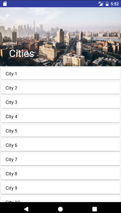
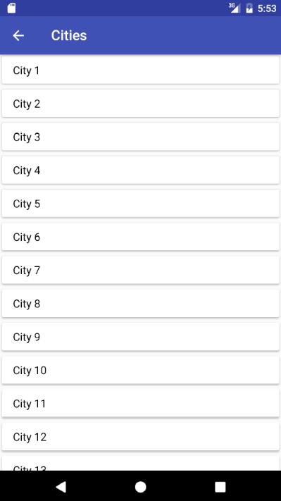
Now, run your application and scroll the screen, you will see that the header image is collapsing slowly and app title text will be shown at toolbar.
Result
 |
 |
To know whether the CollapsingToolbarLayout is collapsed or expanded, we can add a listener addOnOffsetChangedListener on the AppBarLayout instance. Depending upon the if else conditions we show or hide the toolbar info option.
@Override
protected void onCreate(Bundle savedInstanceState) {
    ...

    AppBarLayout barLayout = (AppBarLayout) findViewById(R.id.appBarLayout);
    barLayout.addOnOffsetChangedListener(new AppBarLayout.OnOffsetChangedListener() {
        boolean isShow = false;
        int scrollRange = -1;

        @Override
        public void onOffsetChanged(AppBarLayout appBarLayout, int verticalOffset) {
            if (scrollRange == -1) {
                scrollRange = appBarLayout.getTotalScrollRange();
            }
            if (scrollRange + verticalOffset == 0) {
                isShow = true;
                showOption(R.id.action_info);
            } else if (isShow) {
                isShow = false;
                hideOption(R.id.action_info);
            }
        }
    });
}

...

private void hideOption(int id) {
    MenuItem item = menu.findItem(id);
    item.setVisible(false);
}

private void showOption(int id) {
    MenuItem item = menu.findItem(id);
    item.setVisible(true);
}
Useful links
- Scrolling Behavior for Appbars in Android
- About implementing custom behaviors here and here.
Quote
Categories
- Android
- AngularJS
- Databases
- Development
- Django
- iOS
- Java
- JavaScript
- LaTex
- Linux
- Meteor JS
- Python
- Science
Archive ↓
- September 2024
- December 2023
- November 2023
- October 2023
- March 2022
- February 2022
- January 2022
- July 2021
- June 2021
- May 2021
- April 2021
- August 2020
- July 2020
- May 2020
- April 2020
- March 2020
- February 2020
- January 2020
- December 2019
- November 2019
- October 2019
- September 2019
- August 2019
- July 2019
- February 2019
- January 2019
- December 2018
- November 2018
- August 2018
- July 2018
- June 2018
- May 2018
- April 2018
- March 2018
- February 2018
- January 2018
- December 2017
- November 2017
- October 2017
- September 2017
- August 2017
- July 2017
- June 2017
- May 2017
- April 2017
- March 2017
- February 2017
- January 2017
- December 2016
- November 2016
- October 2016
- September 2016
- August 2016
- July 2016
- June 2016
- May 2016
- April 2016
- March 2016
- February 2016
- January 2016
- December 2015
- November 2015
- October 2015
- September 2015
- August 2015
- July 2015
- June 2015
- February 2015
- January 2015
- December 2014
- November 2014
- October 2014
- September 2014
- August 2014
- July 2014
- June 2014
- May 2014
- April 2014
- March 2014
- February 2014
- January 2014
- December 2013
- November 2013
- October 2013