Content hugging and compression resistance priorities iOS 25.11.2019
You might know that every view has an intrinsic content size. You also learned that if you do not specify constraints that explicitly determine the width or height, the view will derive its width or height from its intrinsic content size. How does this work?
It does this using implicit constraints derived from its content hugging priorities and its content compression resistance priorities. A view has one of each of these priorities for each axis:
- horizontal content hugging priority
- vertical content hugging priority
- horizontal content compression resistance priority
- vertical content compression resistance priority
Content hugging priorities
The content hugging priority is like a rubber band that is placed around a view. The rubber band makes the view not want to be bigger than its intrinsic content size in that dimension. Each priority is associated with a value from 0 to 1000. A value of 1000 means that a view cannot get bigger than its intrinsic content size on that dimension.
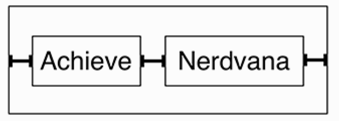
Let’s look at an example with just the horizontal dimension. Say you have two labels next to one another with constraints both between the two views and between each view and its superview.

This works great until the superview becomes wider. At that point, which label should become wider? The first label, the second label, or both? As following figure shows, the interface is currently ambiguous.
This is where the content hugging priority becomes relevant. The view with the higher content hugging priority is the one that does not stretch. You can think about the priority value as the "strength" of the rubber band. The higher the priority value, the stronger the rubber band and the more it wants to hug to its intrinsic content size.
Content compression resistance priorities
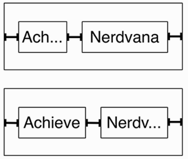
The content compression resistance priorities determine how much a view resists getting smaller than its intrinsic content size. Consider the same two labels. What would happen if the superview’s width decreased? One of the labels would need to truncate its text. But which one?

The view with the greater content compression resistance priority is the one that will resist compression and, therefore, not truncate its text.
Labels, by default, have a greater content hugging priority than text fields, the label hugs to its intrinsic content width and the text field stretches. The label and the text field have the same content compression resistance priorities, which would result in an ambiguous layout if the text field’s text was too long. Open the size inspector for the text field and set its Horizontal Content Compression Resistance Priority to 749. This will ensure that the text field’s text will be truncated if necessary, rather than the label.
Useful links
Quote
Categories
- Android
- AngularJS
- Databases
- Development
- Django
- iOS
- Java
- JavaScript
- LaTex
- Linux
- Meteor JS
- Python
- Science
Archive ↓
- September 2024
- December 2023
- November 2023
- October 2023
- March 2022
- February 2022
- January 2022
- July 2021
- June 2021
- May 2021
- April 2021
- August 2020
- July 2020
- May 2020
- April 2020
- March 2020
- February 2020
- January 2020
- December 2019
- November 2019
- October 2019
- September 2019
- August 2019
- July 2019
- February 2019
- January 2019
- December 2018
- November 2018
- August 2018
- July 2018
- June 2018
- May 2018
- April 2018
- March 2018
- February 2018
- January 2018
- December 2017
- November 2017
- October 2017
- September 2017
- August 2017
- July 2017
- June 2017
- May 2017
- April 2017
- March 2017
- February 2017
- January 2017
- December 2016
- November 2016
- October 2016
- September 2016
- August 2016
- July 2016
- June 2016
- May 2016
- April 2016
- March 2016
- February 2016
- January 2016
- December 2015
- November 2015
- October 2015
- September 2015
- August 2015
- July 2015
- June 2015
- February 2015
- January 2015
- December 2014
- November 2014
- October 2014
- September 2014
- August 2014
- July 2014
- June 2014
- May 2014
- April 2014
- March 2014
- February 2014
- January 2014
- December 2013
- November 2013
- October 2013