Guide to ConstraintLayout in Android Android 21.08.2017

With Android 7, Google has introduced a new layout that is intended to address many of the shortcomings of the older layout managers. This new layout, called ConstraintLayout, combines a simple, expressive and flexible layout system with powerful features built into the Android Studio Designer tool to ease the creation of responsive user interface layouts that adapt automatically to different screen sizes and changes in device orientation.
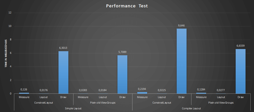
The reason for this new layout is to reduce the view hierarchy’s depth and complexity. By using ConstraintLayout, you can optimize and speed up the UI rendering phase of your application.
You can see measurement of ConstraintLayout performance in image below.
Also you can read Understanding the performance benefits of ConstraintLayout.
ConstraintLayout is a new type of ViewGroup layout introduced by Android, similar to RelativeLayout but more flexible, and it is used to position UI elements relative to other UI elements by using constraints. The aim of ConstraintLayout is to improve the performance of the applications by removing the nested views with a flat and flexible design.
Constraints are essentially sets of rules that dictate the way in which a widget is aligned and distanced in relation to other widgets, the sides of the containing ConstraintLayout and special elements called guidelines. Constraints also dictate how the user interface layout of an activity will respond to changes in device orientation, or when displayed on devices of differing screen sizes. In order to be adequately configured, a widget must have sufficient constraint connections such that it’s position can be resolved by the ConstraintLayout layout engine in both the horizontal and vertical planes.
You can specify the constraints manually, or automatically reference within the layout editor.
Constraints can be defined for one or more sides of a view by connecting the view to:
- an anchor point on another view
- an edge of the layout
- an invisible guideline
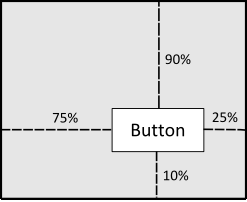
The different types of constraints you can define are as follows:
- Side connection with the layout. Connect the side of a view to the corresponding side of the layout. For example, connect the top side of a view to the top edge of the
ConstraintLayout. - Side connection with a view. Connect the side of a view to the opposite side of another view. For example, connect the top side of a view A to the bottom side of view B so that A is always below B.
- Side alignment with a view. Align the edge of a view to the same edge of another view. For example, align the left side of view A to the left side of view B such that they are vertically stacked and left-aligned.
- Baseline alignment with a view. Align the text baseline of a view to the text baseline of another view. Use this to align views horizontally when it’s more important that the text within the views align than it is that the view edges align.
In principle, the ConstraintLayout works very similar to the RelativeLayout, but uses various handles (or say anchors) for the constraints.
Controlling the dimensions of a widget is a key element of the user interface design process. The ConstraintLayout provides three options which can be set on individual widgets to manage sizing behavior. These settings are configured individually for height and width dimensions:
- Fixed. The widget is fixed to specified dimensions.
- AnySize. Allows the widget to be resized by the layout engine to satisfy the prevailing constraints. Also referred to as the match constraints option. It substitutes
match_parentas it expands as much as possible after accounting for the limits of margins and each of the constraints. - Wrap Content. The size of the widget is dictated by the content it contains (i.e. text or graphics).
Let's install ConstraintLayout. Ensure that you’re running the Android Studio 2.2 preview or above, and Android Support Repository version 32 or higher, it’s required before you can use the ConstraintLayout.
First, you need to add the constraint-layout library to your app’s dependencies within your build.gradle file:
dependencies {
    compile 'com.android.support.constraint:constraint-layout:1.0.2'
}
Sync your project.
Once you have the ConstraintLayout setup, what is next is to add the constraints to the views within that layout.
There are typically two ways to create ConstraintLayout in Android Studio. You can create a new XML layout and select the root element to be a ConstraintLayout or convert an existing layout into a ConstraintLayout.
In XML, constraints take the following format:
layout_constraint[SourceAnchor]_[TargetAnchor]="[TargetId]"
Following is ConstraintLayout attributes
| Attribute | Effect |
|---|---|
| layout_constraintTop_toTopOf | Aligns the top of the desired view to the top of another. |
| layout_constraintTop_toBottomOf | Aligns the top of the desired view to the bottom of another. |
| layout_constraintBottom_toTopOf | Aligns the bottom of the desired view to the top of another. |
| layout_constraintBottom_toBottomOf | Aligns the bottom of the desired view to the bottom of another. |
| layout_constraintLeft_toTopOf | Aligns the left of the desired view to the top of another. |
| layout_constraintLeft_toBottomOf | Aligns the left of the desired view to the bottom of another. |
| layout_constraintLeft_toLeftOf | Aligns the left of the desired view to the left of another. |
| layout_constraintLeft_toRightOf | Aligns the left of the desired view to the right of another. |
| layout_constraintRight_toTopOf | Aligns the right of the desired view to the top of another. |
| layout_constraintRight_toBottomOf | Aligns the right of the desired view to the bottom of another. |
| layout_constraintRight_toLeftOf | Aligns the right of the desired view to the left of another. |
| layout_constraintRight_toRightOf | Aligns the right of the desired view to the right of another. |
| layout_constraintCenterX_toCenterX | Aligns the desired view horizontally so that its centers X coordinate is the same as the other views center X coordinate. |
| layout_constraintCenterY_toCenterY | Aligns the desired view vertically so that its centers Y coordinate is the same as the other views center Y coordinate. |
| layout_constraintBaseline_toBaselineOf | Aligns the baseline of the desired view to the baseline of another. Not every view has baseline! |
All of the above mentioned attributes require the ID of the targeted View as the parameter. The class also supports attributes with start and end in place of left and right alignment.
Please note that if you set width or height of the child of Constraint Layout to 0dp, it means that it will fill available space. There’s no match_parent value for children of Constraint Layout.
For example, a constraint between the end of @id/btn and the start of @id/tv would look like:
<Button
    android:id="@+id/btn"
    .../>

<TextView
    android:id="@+id/tv"
    app:layout_constraintStart_toEndOf="@+id/btn"
    .../>
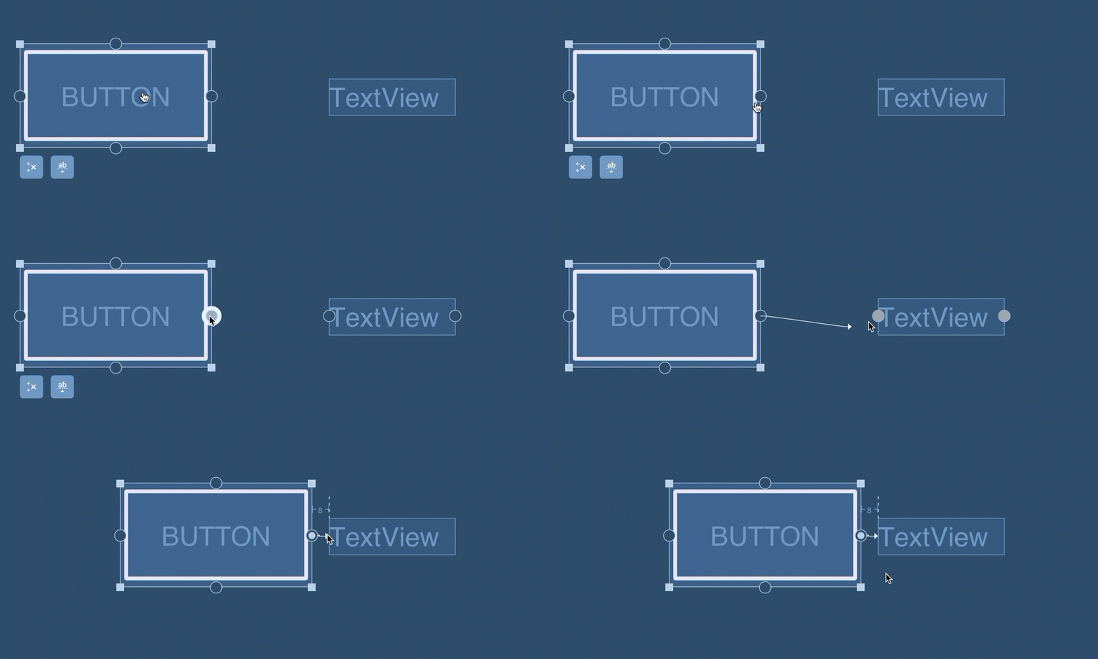
Chains are a specific kind of constraint which allow us to share space between the views within the chain and control how the available space is divided between them. Creating chains is a new feature that lets you position views along a single axis (horizontal or vertical), that conceptually is a bit similar to a LinearLayout. In other words, the simplest chain consists of two views that have constraints against each other in the same dimension. As implemented by ConstraintLayout, a chain is a series of views which are linked via bi-directional connections.
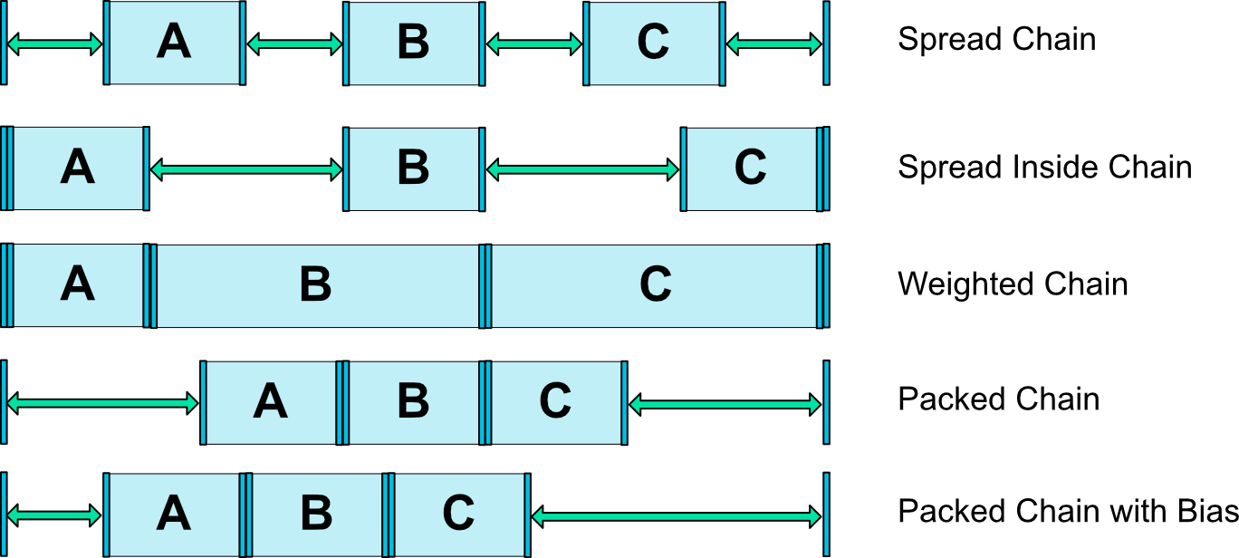
There are three possible modes: spread, spread_inside, and packed
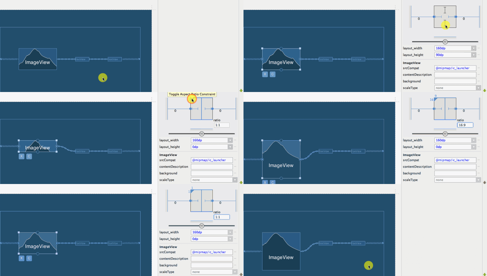
Ratios. Ratios let you accomplish roughly the same thing as a PercentFrameLayout, i.e. restrict a View to a set width to height ratio, without the overhead of the additional ViewGroup in your hierarchy.
Guidelines. Guidelines are virtual views that help you position other views in the layout. They aren’t visible during runtime, but can be used to attach constraints to. To create a vertical or horizontal guideline, select it from the dropdown.
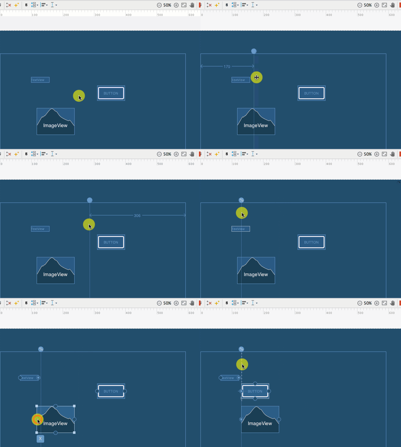
I find them very useful as they allow us to do some work more easily than it was before. For example, let’s imagine a situation when you want to set the view’s width to be 30% of parent’s width and height to fill the parent’s height. The only thing you need to do is to add vertical Guideline in 30% of parent’s width and set the width and height of the added view to be 0dp.
Also you can see visual tutorial.
To sum up, here are some key features that ConstraintLayout provides us with:
- has backwards compatibility (it is available in Support Library compatible with Android 2.3 and higher)
- the layout of each view is defined by associations to other elements in the layout, you can create a complex layout with a flat view hierarchy
- possibility to position views anywhere using percentages (bias)
- guidelines, which can help to position the view or set the view’s width/height to be some percentage of parent’s width/height
- we should be able to reduce nesting layouts when using Constraint Layout
Useful links
Quote
Categories
- Android
- AngularJS
- Databases
- Development
- Django
- iOS
- Java
- JavaScript
- LaTex
- Linux
- Meteor JS
- Python
- Science
Archive ↓
- September 2024
- December 2023
- November 2023
- October 2023
- March 2022
- February 2022
- January 2022
- July 2021
- June 2021
- May 2021
- April 2021
- August 2020
- July 2020
- May 2020
- April 2020
- March 2020
- February 2020
- January 2020
- December 2019
- November 2019
- October 2019
- September 2019
- August 2019
- July 2019
- February 2019
- January 2019
- December 2018
- November 2018
- August 2018
- July 2018
- June 2018
- May 2018
- April 2018
- March 2018
- February 2018
- January 2018
- December 2017
- November 2017
- October 2017
- September 2017
- August 2017
- July 2017
- June 2017
- May 2017
- April 2017
- March 2017
- February 2017
- January 2017
- December 2016
- November 2016
- October 2016
- September 2016
- August 2016
- July 2016
- June 2016
- May 2016
- April 2016
- March 2016
- February 2016
- January 2016
- December 2015
- November 2015
- October 2015
- September 2015
- August 2015
- July 2015
- June 2015
- February 2015
- January 2015
- December 2014
- November 2014
- October 2014
- September 2014
- August 2014
- July 2014
- June 2014
- May 2014
- April 2014
- March 2014
- February 2014
- January 2014
- December 2013
- November 2013
- October 2013
