How to decorate Button widget in Android Android 16.02.2017
In this tutorial you will learn how to create a Button with different shapes in Android. Shape drawable resource is used to define shape of a view.
Create rect_button.xml file inside res/drawable folder.
<?xml version="1.0" encoding="utf-8"?>
<shape xmlns:android="http://schemas.android.com/apk/res/android"
    android:shape="rectangle">
    <stroke android:color="#FF6F00" android:width="1dip"/>
    <solid android:color="#FFC107"/>
    <size android:width="100dp" android:height="100dp"/>
</shape>
shapedefines shape of view and must be the root element. It can be rectangle, oval, line (requires the<stroke>element to define the width of the line) and ring. In this case we are using oval shape to make theButtoncircular.strokedefines boundary of shape.soliddefines background color of shape.sizedefines size of shape.
Now set this xml as background of the Button.
<Button
    android:text="Button"
    android:layout_width="wrap_content"
    android:layout_height="wrap_content"
    android:background="@drawable/rect_button"/>
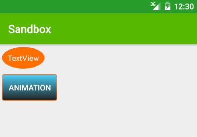
Let's add corners, size and gradient.
<corners android:radius="3dip" />
<size android:width="100dp" android:height="30dp" />
<gradient
    android:angle="270"
    android:startColor="#DD2ECCFA"
    android:endColor="#DD000000"/>
The button will look like
Following are snippets for different shapes.
Cicrle
<shape xmlns:android="http://schemas.android.com/apk/res/android"
    android:shape="oval">

    <solid android:color="@color/md_red_600" />
    <padding
        android:bottom="5dp"
        android:left="5dp"
        android:right="5dp"
        android:top="5dp" />
</shape>
Rectangle
<shape xmlns:android="http://schemas.android.com/apk/res/android"
    android:shape="rectangle">

    <solid android:color="@color/md_red_600" />
    <padding
        android:bottom="5dp"
        android:left="5dp"
        android:right="5dp"
        android:top="5dp" />
</shape>
Ring
<shape xmlns:android="http://schemas.android.com/apk/res/android"
    android:shape="ring">

    <solid android:color="@color/md_red_600" />
    <padding
        android:bottom="5dp"
        android:left="5dp"
        android:right="5dp"
        android:top="5dp" />
</shape>
Line
<shape xmlns:android="http://schemas.android.com/apk/res/android"
    android:shape="line">

    <solid android:color="@color/md_red_600" />
    <stroke android:width="1dp" />
    <padding
        android:bottom="5dp"
        android:left="5dp"
        android:right="5dp"
        android:top="5dp" />
</shape>
Also we can set shape for a TextView
<TextView
    android:id="@+id/tvLabel"
    android:layout_width="wrap_content"
    android:layout_height="wrap_content"
    android:background="@drawable/circle"
    android:layout_margin="5dp"
    android:text="TextView"
    android:textColor="#FFFFFF"/>
or programmatically
TextView tvLabel = (TextView) findViewByID (R.id.tvLabel);
tvLabel.setBackgroundResource(R.id.circle);
Last stuff I want to expose is style for Button. First, define style in res/values/styles.
<resources>
    <style name="AppTheme" parent="Theme.AppCompat.Light.DarkActionBar">
        <!-- Customize your theme here. -->
        <item name="colorPrimary">@color/colorPrimary</item>
        <item name="colorPrimaryDark">@color/colorPrimaryDark</item>
        <item name="colorAccent">@color/colorAccent</item>
    </style>

    <style name="ButtonStyle" parent="Theme.AppCompat.Light">
        <item name="colorControlHighlight">#FFCCBC</item>
        <item name="colorButtonNormal">#FF5722</item>
    </style>
</resources>
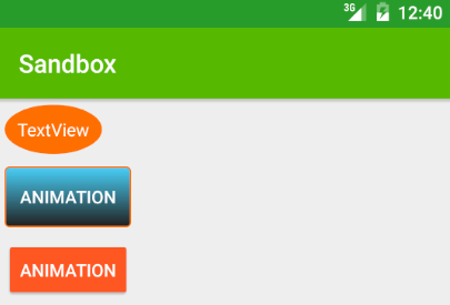
Second, set style for Button
<Button
    android:text="Animation"
    android:layout_width="wrap_content"
    android:layout_height="wrap_content"
    android:layout_margin="5dp"
    android:textColor="#FFFFFF"
    android:theme="@style/ButtonStyle"
    />
The button will look like
Quote
Formal education will make you a living. Self-education will make you a fortune.
Jim Rohn
Categories
- Android
- AngularJS
- Databases
- Development
- Django
- iOS
- Java
- JavaScript
- LaTex
- Linux
- Meteor JS
- Python
- Science
Archive ↓
- September 2024
- December 2023
- November 2023
- October 2023
- March 2022
- February 2022
- January 2022
- July 2021
- June 2021
- May 2021
- April 2021
- August 2020
- July 2020
- May 2020
- April 2020
- March 2020
- February 2020
- January 2020
- December 2019
- November 2019
- October 2019
- September 2019
- August 2019
- July 2019
- February 2019
- January 2019
- December 2018
- November 2018
- August 2018
- July 2018
- June 2018
- May 2018
- April 2018
- March 2018
- February 2018
- January 2018
- December 2017
- November 2017
- October 2017
- September 2017
- August 2017
- July 2017
- June 2017
- May 2017
- April 2017
- March 2017
- February 2017
- January 2017
- December 2016
- November 2016
- October 2016
- September 2016
- August 2016
- July 2016
- June 2016
- May 2016
- April 2016
- March 2016
- February 2016
- January 2016
- December 2015
- November 2015
- October 2015
- September 2015
- August 2015
- July 2015
- June 2015
- February 2015
- January 2015
- December 2014
- November 2014
- October 2014
- September 2014
- August 2014
- July 2014
- June 2014
- May 2014
- April 2014
- March 2014
- February 2014
- January 2014
- December 2013
- November 2013
- October 2013