A prime about descriptive statistics in R Science 01.06.2016
In statistics, data can initially be considered to be one of three basic types: categorical data, discrete data, and continuous data.
- Categorical data is data that records categories. An example is a survey that records whether a person is for or against a specific proposition.
- Discrete data can only take certain values. Example: the number of students in a class (you can't have half a student).
- Continuous data can take any value (within a range). Examples: a person's height, could be any value (within the range of human heights), not just certain fixed heights; a dog's weight.
When a data set consists of a single variable, it is called a univariate data set. When there are two variables in a data set, the data is bivariate, and when there are two or more variables the data set is multivariate.
Univariate data set
The center: mean, median, and mode
For univariate data, we want to understand the distribution of the data. It is also convenient to have concise, numeric summaries of a data set. Not only will the numeric summaries simplify a description of the data—they also allow us to compare different data sets quantitatively. Let's look at central tendency: mean, median, and mode.
The most familiar notion of the center of a numeric data set is the average value of the numbers. In statistics, the average of a data set is called the sample mean and is denoted by .
The mean() function will compute the sample mean for a data vector. Additional arguments include trim to perform a trimmed mean and na.rm for removal of missing data. The mean is the most familiar notion of center, but there are times when it isn’t the best.
A more resistant measure of the center is the sample median, which is the middle value of a distribution of numbers. Arrange the data from smallest to biggest. When there is an odd number of data points, the median is the middle one; when there is an even number of data points, the median is the average of the two middle ones.
The sample median is found in R with the median() function.
v = c(50,60,100,75,200)
> mean(v)
[1] 97
> median(v)
[1] 75
A modification of the mean that makes it more resistant is the trimmed mean. To compute the trimmed mean, we compute the mean after trimming a certain percentage of the smallest and largest values from the data. Consequently, if there are a few values that skew the mean, they won’t skew the trimmed mean.
Distributions allow us to characterize a large number of values using a smaller number of parameters. The normal distribution, which describes many types of real-world data, can be defined with just two: center and spread. The center of normal distribution is defined by its mean value. The spread is measured by a statistic called the standard deviation.
Variation: the variance, standard deviation
Measuring the mean and median provides one way to quickly summarize the values, but these measures of center tell us little about whether or not there is diversity in the measurements. To measure the diversity, we need to employ another type of summary statistics that is concerned with the spread of data, or how tightly or loosely the values are spaced. Knowing about the spread provides a sense of the data's highs and lows and whether most values are like or unlike the mean and median.
So, the center of a distribution of numbers may not adequately describe the entire distribution.
There are many ways to measure spread. The simplest is the range of the data. Sometimes the range refers to the distance between the smallest and largest values, and other times it refers to these two values as a pair.
Using the idea of a center, we can think of variation in terms of deviations from the center. Using the mean for the center, the variation of a single data point can be assessed using the value . A sum of all these differences will give a sense of the total variation. Just adding these values gives a value of 0. A remedy is to add the squared deviations
.
If there is a lot of spread in the data, then this sum will be relatively large; if there is not much spread, it will be relatively small. Of course, this sum can be large because n is large, not just because there is much spread. We take care of that by dividing our sum by a scale factor. If we divided by n we would have the average squared deviation. It is conventional, though, to divide by n−1, producing the sample variance.
The sample standard deviation is the square root of the variance. It has the advantage of having the same units as the mean. However, the interpretation remains: large values indicate more spread.
a = c(80,85,75,77,87,82,88)
b = c(100,90,50,57,82,100,86)

mean(a) # 82
mean(b) # 80.71429

var(a) # 24.66667
var(b) # 394.2381

sd(a) # 4.966555
sd(b) # 19.85543
While interpreting the variance, larger numbers indicate that the data are spread more widely around the mean. The smaller the variance, the closer the numbers are to the mean and the larger the variance, the farther away the numbers are from the mean.
The standard deviation indicates, on average, how much each value differs from the mean.
Outcome:
-
Variance. Tells you the average squared deviation from the mean. It’s mathematically elegant, and is probably the "right" way to describe variation around the mean, but it’s completely uninterpretable because it doesn’t use the same units as the data. Almost never used except as a mathematical tool; but it’s buried 'under the hood' of a very large number of statistical tools.
-
Standard deviation. This is the square root of the variance. It’s fairly elegant mathematically, and it’s expressed in the same units as the data so it can be interpreted pretty well. This is by far the most popular measure of variation.
Quartiles: dividing data to parts
Quartiles are a special case of a type of statistics called quantiles, which are numbers that divide data into equally sized quantities. In addition to quartiles (four parts, Q1, Q2, Q3, Q4), commonly used quantiles include tertiles (three parts), quintiles (five parts), deciles (10 parts), and percentiles (100 parts).
The middle 50 percent of data between the first and third quartiles is of particular interest because it in itself is a simple measure of spread. The difference between Q1 and Q3 is known as the Interquartile Range (IQR), and it can be calculated with the IQR() function:
data = c(80,85,75,77,87,82,88)
IQR(data)
The quantile() function provides a robust tool to identify quantiles for a set of values.
quantile(data)
If we specify an additional probs parameter using a vector denoting cut points, we can obtain arbitrary quantiles, such as the 1st and 99th percentiles:
quantile(data, probs = c(0.01, 0.99))
The seq() function is used to generate vectors of evenly-spaced values. This makes it easy to obtain other slices of data, such as the quintiles, as shown in the following command:
quantile(data, seq(from = 0, to = 1, by = 0.20))
Multivariate data set
With univariate data, we summarized a data set with measures of center and spread. With bivariate and multivariate data we can ask additional questions about the relationship between the variables.
Positive relationship means that as the value of one variable increases, the value of the other also tends to increase. Negative relationship means that as the value of one variable increases, the value of the other tends to decrease. The most commonly used measures of association are:
- Covariance. A measure of the linear relationship between two continuous variables. Covariance is scale dependent, meaning that the value depends on the units of measurements used for the variables. For this reason, it is difficult to directly interpret the covariance value. The higher the absolute covariance between two variables, the greater the association. Positive values indicate positive association and negative values indicate negative association.
- Pearson’s correlation coefficien. A scale independent measure of relationship, meaning that the value is not affected by the unit of measurement. The correlation can take values between -1 and 1, where -1 indicates perfect negative correlation, 0 indicates no correlation and 1 indicates perfect positive correlation. The correlation coefficient only measures linear relationships, so it is important to check for nonlinear relationships with a scatter plot.
- Spearman’s rank correlation coefficient. A nonparametric alternative to the Pearson’s correlation coefficient, which measures nonlinear as well as linear relationships. It also takes values between -1 (perfect negative correlation) and 1 (perfect positive correlation), with a value of 0 indicating no correlation. Spearman’s correlation can be calculated for ranked as well as continuous data.
So, correlation is a statistical technique that can show whether and how strongly pairs of variables are related. For example, height and weight are related; taller people tend to be heavier than shorter people.
Pearson correlation coefficient
The main result of a correlation is called the correlation coefficient (or, more specifically, Pearson’s correlation coefficient), which is traditionally denoted by r. It ranges from -1.0 to +1.0.
- If r is close to 0, it means there is no relationship between the variables.
- If r is positive, it means that as one variable gets larger the other gets larger.
- If r is negative it means that as one gets larger, the other gets smaller (often called an "inverse" correlation).
Calculating correlations in R can be done using the cor() command. The simplest way to use the command is to specify two input arguments x and y, each one corresponding to one of the variables.
I'm using iris data.
cor(x=iris$Sepal.Length, y=iris$Sepal.Width)
[1] -0.1175698
However, the cor() function is a bit more powerful than this simple example suggests. For example, you can also calculate a complete 'correlation matrix', between all pairs of variables in the data frame.
cor(x=iris[1:4])
If any of the variables have missing values, set the use argument to pairwise
cor(x=iris[1:4], use="pairwise")
Analyzing the correlation table is interesting but, it is also possible to work with a graphic expression
# install.packages("ellipse")
library("ellipse")

# build the correlations matrix
corr = cor(iris[1:4])

# plot the correlation matrix by ellipses
plotcorr(corr, col=rainbow(10))
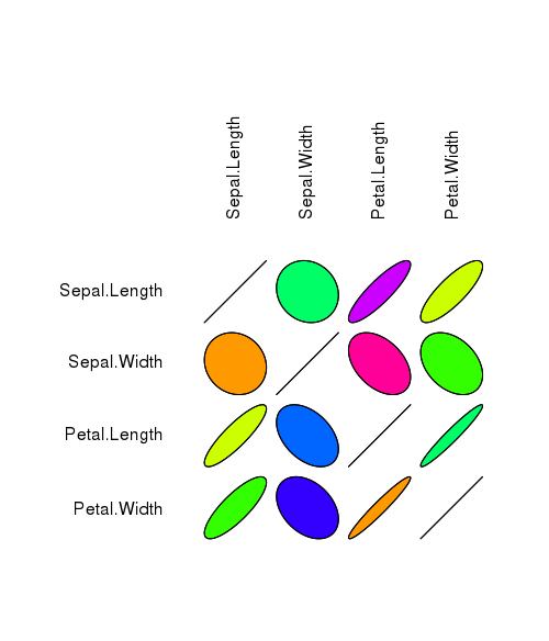
The plotcorr function plots a correlation matrix using ellipse-shaped glyphs for each entry. The ellipse represents a level curve of the density of a bivariate normal with the matching correlation.
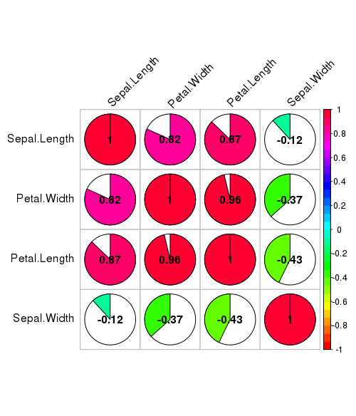
You can also use the library corrplot because it has many options for displaying correlation matrices
# install.packages("corrplot")
library("corrplot")

# plot the correlation matrix
corrplot(corr, method="pie", shade.col=NA, tl.col="black", tl.srt=45, col=rainbow(50), addCoef.col="black", order="AOE")
Spearman’s rank correlations
The Pearson correlation coefficient is useful for a lot of things, but it does have shortcomings. One issue in particular stands out: what it actually measures is the strength of the linear relationship between two variables.
One very common situation where the Pearson correlation isn’t quite the right thing to use arises when an increase in one variable X really is reflected in an increase in another variable Y, but the nature of the relationship isn’t necessarily linear.
An example of this might be the relationship between effort and reward when studying for an exam. If you put in zero effort (X) into learning a subject, then you should expect a grade of 0% (Y). As everyone knows, it takes a lot more effort to get a grade of 90% than it takes to get a grade of 55%.
The cor function can also calculate the Spearman’s rank correlation coefficient between two variables. Set the method argument to spearman
cor(x=iris$Sepal.Length, y=iris$Sepal.Width, method="spearman")
[1] -0.1667777
Hypothesis Test of Correlation
A hypothesis test of correlation determines whether a correlation is statistically significant. The null hypothesis for the test is that the population correlation is equal to zero, meaning that there is no correlation between the variables. The alternative hypothesis is that the population correlation is not equal to zero, meaning that there is some correlation between the variables.
You can also perform a one-sided test, where the alternative hypothesis is either that the population correlation is greater than zero (the variables are positively correlated) or that the population correlation is less than zero (the variables are negatively correlated).
You can perform a test of the correlation between two variables with the cor.test function
cor.test(iris$Petal.Length, iris$Petal.Width)
The correlation is estimated at 0.9628654, with a 95% confidence interval of 0.9490525 to 0.9729853. This means that as petal length increases, petal width tends to increase also. Because the p-value of 2.2e-16 is much less than the significance level of 0.05, we can reject the null hypothesis that there is no correlation between length and width, in favor of the alternative hypothesis that the two are correlated.
By default, R performs a test of the Pearson’s correlation. If you would prefer to test the Spearman’s correlation, set the method argument to spearman
cor.test(iris$Petal.Length, iris$Petal.Width, method="spearman")
By default, R performs a two-sided test, but you can adjust this by setting the alternative argument to less or greater as required
cor.test(iris$Petal.Length, iris$Petal.Width, alternative="greater")
Summary statistic for multivariate data set
To produce a summary of all the variables in a dataset, use the summary function. The function summarizes each variable in a manner suitable for its class. For numeric variables, it gives the mean, median, range, and interquartile range. For factor variables, it gives the number in each category. If a variable has any missing values, it will tell you how many.
summary(iris)
To calculate a particular statistic for each of the variables in a dataset simultaneously, use the sapply function with any of the statistics function
sapply(iris[1:4], mean)
Quote
Categories
- Android
- AngularJS
- Databases
- Development
- Django
- iOS
- Java
- JavaScript
- LaTex
- Linux
- Meteor JS
- Python
- Science
Archive ↓
- September 2024
- December 2023
- November 2023
- October 2023
- March 2022
- February 2022
- January 2022
- July 2021
- June 2021
- May 2021
- April 2021
- August 2020
- July 2020
- May 2020
- April 2020
- March 2020
- February 2020
- January 2020
- December 2019
- November 2019
- October 2019
- September 2019
- August 2019
- July 2019
- February 2019
- January 2019
- December 2018
- November 2018
- August 2018
- July 2018
- June 2018
- May 2018
- April 2018
- March 2018
- February 2018
- January 2018
- December 2017
- November 2017
- October 2017
- September 2017
- August 2017
- July 2017
- June 2017
- May 2017
- April 2017
- March 2017
- February 2017
- January 2017
- December 2016
- November 2016
- October 2016
- September 2016
- August 2016
- July 2016
- June 2016
- May 2016
- April 2016
- March 2016
- February 2016
- January 2016
- December 2015
- November 2015
- October 2015
- September 2015
- August 2015
- July 2015
- June 2015
- February 2015
- January 2015
- December 2014
- November 2014
- October 2014
- September 2014
- August 2014
- July 2014
- June 2014
- May 2014
- April 2014
- March 2014
- February 2014
- January 2014
- December 2013
- November 2013
- October 2013