About shape, state list, layer list and nine-patch drawables in Android Android 15.06.2017
A drawable resource is a general concept for a graphic that can be drawn to the screen. Drawables are used to define shapes, colors, borders, gradients, etc. which can then be applied to views within an Activity.
This is typically used for customizing the view graphics that are displayed within a particular view or context. Drawables tend to be defined in XML and can then be applied to a view via XML or Java.
Every drawable is stored as individual files in one of the res/drawable folders. Drawables are referred to in XML via @drawable/filename whereby filename is the filename without the file extension.
<TextView
    android:id="@+id/tvTitle"
    android:layout_width="wrap_content"
    android:layout_height="wrap_content"
    android:background="@drawable/filename"
    android:text="@string/greeting" />
In code you can also assign drawables to views. Most views accept an resource ID as input parameter. For example the following code shows how to set a drawables as background to an ImageView.
ImageView imageView = (ImageView) findViewById(R.id.image);
imageView.setImageResource(R.drawable.hello);
Sometimes it's useful to get the name of drawable (for example, R.drawable.recource_name)
getResources().getIdentifier("recource_name","drawable", getPackageName())
and vice versa
String resName = "recource_name";
int resID = getResources().getIdentifier(resName , "drawable", getPackageName());
There are several different types of drawables:
- Bitmap File. A bitmap graphic file (.png, .jpg, or .gif). Creates a
BitmapDrawable. - Nine-Patch File. A PNG file with stretchable regions to allow image resizing based on content (.9.png). Creates a
NinePatchDrawable. - Layer List. A Drawable that manages an array of other Drawables. These are drawn in array order, so the element with the largest index is be drawn on top. Creates a
LayerDrawable. - State List. An XML file that references different bitmap graphics for different states (for example, to use a different image when a button is pressed). Creates a
StateListDrawable. - Level List. An XML file that defines a drawable that manages a number of alternate Drawables, each assigned a maximum numerical value. Creates a
LevelListDrawable. - Transition Drawable. An XML file that defines a drawable that can cross-fade between two drawable resources. Creates a
TransitionDrawable. - Inset Drawable. An XML file that defines a drawable that insets another drawable by a specified distance. This is useful when a
Viewneeds a background drawble that is smaller than theView's actual bounds. - Clip Drawable. An XML file that defines a drawable that clips another Drawable based on this Drawable's current level value. Creates a
ClipDrawable. - Scale Drawable. An XML file that defines a drawable that changes the size of another Drawable based on its current level value. Creates a
ScaleDrawable. - Shape Drawable. An XML file that defines a geometric shape, including colors and gradients. Creates a
ShapeDrawable.
There are five drawables that are most important to know:
- Shape Drawables. Defines a shape with properties such as
stroke,fill, andpadding. - State List Drawables. Defines a list of drawables to use for different states.
- Layer List Drawables. Defines a list of drawables grouped together into a composite result.
- Nine-Patch Drawables. A PNG file with stretchable regions to allow proper resizing.
- Vector Drawables. Defines complex XML-based vector images. One more link.
Let's explore these drawable file types one by one and take a look at examples of usage.
Bitmap Drawables
Using XML, we can define some rules around which a smaller image should be stepped and repeated to make a pattern. This can be a great way to make full-screen background images that don’t require a large Bitmap to be loaded into memory. Applications can create a pattern by setting the tileMode attribute on a <bitmap> element to one of the following values:
Clamp. The source bitmap will have the pixels along its edges replicated.Repeat. The source bitmap will be stepped and repeated in both directions.Mirror. The source bitmap will be stepped and repeated, alternating between normal and flipped images on each iteration and along each axis.
Following is file res/drawable/pattern_stripes.xml
<?xml version="1.0" encoding="utf-8"?>
<bitmap xmlns:android="http://schemas.android.com/apk/res/android"
    android:src="@drawable/stripes"
    android:tileMode="mirror" />
Tinting Drawable elements
Sometimes you want to avoid duplicating common assets that vary only by color by dynamically coloring a baseline asset at runtime. There are two ways for it.
- API Level 1. Use a color filter to apply a color mask to any
Drawableinstance.Drawablecolor filters are typically fully opaque, but the framework also supports partial blending viaPorterDuff.XferMode. This method can be executed only from Java code. - API Level 21. Use the native tint functionality available on any
Drawableinstance viaandroid:tintin XML orsetTint()from Java code. In this case, blending can be applied viaandroid:tintModeorsetTintMode()either of which takes a Porter-Duff constant to represent the transfer mode.
For a Porter-Duff color blend to apply correctly, areas of the icons that should not be modified need to be fully transparent, not solid white. The remaining pixels don't need to be black, but they must be fully opaque.
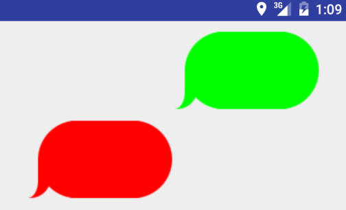
Following listing shows us the simple layout used to place these images into the activity.
<?xml version="1.0" encoding="utf-8"?>
<RelativeLayout xmlns:android="http://schemas.android.com/apk/res/android"
    xmlns:app="http://schemas.android.com/apk/res-auto"
    xmlns:tools="http://schemas.android.com/tools"
    android:layout_width="match_parent"
    android:layout_height="match_parent"
    android:padding="5dp">

    <ImageView
        android:id="@+id/ivMessage1"
        android:layout_width="200dp"
        android:layout_height="wrap_content"
        android:src="@drawable/message_bg"
        android:layout_alignParentRight="true"/>

    <ImageView
        android:id="@+id/ivMessage2"
        android:layout_width="200dp"
        android:layout_height="wrap_content"
        android:src="@drawable/message_bg"
        android:layout_alignParentLeft="true"
        android:layout_below="@id/ivOriginal"/>
</RelativeLayout>
Following listing shows us an activity with the code to tint the icons.
public class TintActivity extends AppCompatActivity {
    ImageView ivMessage1, ivMessage2;

    @Override
    protected void onCreate(Bundle savedInstanceState) {
        super.onCreate(savedInstanceState);
        setContentView(R.layout.activity_tint);

        ivMessage1 = (ImageView) findViewById(R.id.ivMessage1);
        ivMessage1.getDrawable().mutate().setColorFilter(0xFFFF0000, PorterDuff.Mode.SRC_ATOP);
        //ivMessage1.setColorFilter(ContextCompat.getColor(getContext,R.color.COLOR_YOUR_COLOR));

        ivMessage2 = (ImageView) findViewById(R.id.ivMessage2);
        ivMessage2.getDrawable().mutate().setColorFilter(0xFF00FF00, PorterDuff.Mode.SRC_ATOP);
        //ivMessage2.setColorFilter(Color.argb(255, 255, 255, 255));
    }
}
Using the setColorFilter() method, any Drawable can be drawn with a tint. The simplest version of this method (which we have used here) accepts the ARGB color value and a PorterDuff.Mode for pixel transfer and blending. Our choice of SRC_ATOP ensures that the chosen color will be drawn fully and the original image pixel ignored.
If your base image has variations (for example, a gradient) that you would like to show through, pick a filter color that is partially transparent and/or try a different PorterDuff.Mode value, such as MULTIPLY.
Starting in Android 5.0, this same effect can be applied to drawables from XML by using the android:tint attribute, or in code via setTint(). Underneath your code, the framework is using the same technique you just saw, although slightly more efficiently since the framework can now share states that have a common tint.
Following listings redefine our icon assets as tinted drawables.
File res/drawable/tinted_bg.xml.
<?xml version="1.0" encoding="utf-8"?>
<bitmap xmlns:android="http://schemas.android.com/apk/res/android"
    android:src="@drawable/message_bg"
    android:tint="#FFAA00AA" />
Now when we insert these drawables into the activity layout, there is no further colorization work to do.
File res/layout/activity_tinted.xml.
<?xml version="1.0" encoding="utf-8"?>
<RelativeLayout xmlns:android="http://schemas.android.com/apk/res/android"
    xmlns:app="http://schemas.android.com/apk/res-auto"
    xmlns:tools="http://schemas.android.com/tools"
    android:layout_width="match_parent"
    android:layout_height="match_parent"
    android:padding="5dp">

    <ImageView
        android:id="@+id/ivMessage1"
        android:layout_width="200dp"
        android:layout_height="wrap_content"
        android:src="@drawable/activity_tinted"
        android:layout_alignParentRight="true"/>
</RelativeLayout>
Simple Activity for tinted drawables.
public class TintActivity extends ActionBarActivity {
    @Override
    protected void onCreate(Bundle savedInstanceState) {
        super.onCreate(savedInstanceState);
        setContentView(R.layout.activity_tinted);
    }
}
android:tint attribute will only work on Lollipop and later API versions. How could we support older devices? There are two easy ways, one can choose any of them:
Use android.support.v4.graphics.drawable.DrawableCompat.
Drawable drawable = getResources().getDrawable(R.drawable.message_bg);
Drawable wrapped = DrawableCompat.wrap(drawable);
wrapped.mutate(); // to not share its state with any other drawable
DrawableCompat.setTint(wrapped, ContextCompat.getColor(getContext(), R.color.your_color));
Tint ImageView manually.
ImageView ivMessage = (ImageView) findViewById(R.id.ivMessage1);
ivMessage.setColorFilter(ContextCompat.getColor(context,R.color.COLOR_YOUR_COLOR),
PorterDuff.Mode.SRC_ATOP);
Result
Shape Drawables
The Shape Drawable is an XML file that defines a geometric shape, including colors and gradients. This is used to create a complex shape that can then be attached as the background of a layout or a view on screen. For example, you can use a shape drawable to change the shape, border, and gradient of a Button background.
A shape is simply a collection of properties that are combined to describe a background. The shape can be described with properties such as corners for rounding, gradient for backgrounds, padding for spacing, solid for background colors, and stroke for border.
Shape drawables provide four basic shapes: Rectangle, Oval, Line and Ring. From these shapes you can create an almost unlimited number of effects and styles for your application.
- solid specifies solid background color.
- gradient specifies gradient backgrounds.
- padding specifies padding between the edge of the shape and its contents.
- size specifies the width and height.
- stroke specifies a stroke line around the edge of the shape.
Solid Color Shapes
Here's an example of drawing a rounded rectangle with a border in res/layout/drawable/solid_color_shape.xml:
<?xml version="1.0" encoding="utf-8"?>
<shape
    xmlns:android="http://schemas.android.com/apk/res/android"
    android:shape="rectangle">

    <corners android:radius="4dp" />
    <stroke android:width="4dp" android:color="#C1E1A6" />
    <solid android:color="#118C4E" />
    <padding
        android:left="20dp"
        android:top="20dp"
        android:right="20dp"
        android:bottom="20dp" />
</shape>
and then applied to a TextView using the background property:
<TextView
   android:layout_width="wrap_content"
   android:layout_height="wrap_content"
   android:background="@drawable/solid_color_shape"
   android:textColor="#ffffff"
   android:text="@string/greeting" />
and the resulting view looks like:
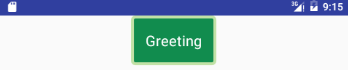
Note that drawables can be applied to any view and are usually set with the background property referencing the drawable resource.
We can create a border programmatically
ShapeDrawable shape = new ShapeDrawable(new RectShape());
shape.getPaint().setColor(Color.RED);
shape.getPaint().setStyle(Paint.Style.STROKE);
shape.getPaint().setStrokeWidth(3);

// Assign the created border to EditText widget
view.setBackground(shape);
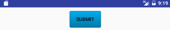
Gradient Colored Shapes
Shapes also support gradients backgrounds as well as supporting properties such as startColor, centerColor, endColor, angle. Different gradients such as radial, linear or sweep can be selected using the type property.
Here's an example of a simple linear gradient shape specified in res/layout/drawable/gradient_shape.xml:
<?xml version="1.0" encoding="utf-8"?>
<shape
    xmlns:android="http://schemas.android.com/apk/res/android"
    android:shape="rectangle" >

    <corners android:radius="4dp" />
    <stroke android:width="1dp" android:color="#0078a5" />
    <gradient
        android:startColor="#0078a5"
        android:endColor="#00adee"
        android:angle="90"/>
    <padding
        android:left="8dp"
        android:top="2dp"
        android:right="8dp"
        android:bottom="2dp" />
</shape>
applied to a Button and the resulting view looks like:
On Android, colors are can be specified as RGB or ARGB. In RGB you have two characters for every color (red, green, blue), and in ARGB you have two additional chars for the alpha channel. Android uses hexadecimal ARGB values, which are formatted as #AARRGGBB. That first pair of letters, the AA, represent the alpha channel.
Following is some useful opacity values
- 100% — FF
- 95% — F2
- 90% — E6
- 85% — D9
- 80% — CC
- 75% — BF
- 70% — B3
- 65% — A6
- 60% — 99
- 55% — 8C
- 50% — 80
- 45% — 73
- 40% — 66
- 35% — 59
- 30% — 4D
- 25% — 40
- 20% — 33
- 15% — 26
- 10% — 1A
- 5% — 0D
- 0% — 00
We can create a gradient drawable programmatically
GradientDrawable gradient = new GradientDrawable();
gradient.setColors(new int[]{
        Color.parseColor("#feffe9"),
        Color.parseColor("#fff600"),
        Color.parseColor("#feffe9"),
});

gradient.setGradientType(GradientDrawable.LINEAR_GRADIENT);
gradient.setShape(GradientDrawable.RECTANGLE);
gradient.setStroke(2, Color.parseColor("#cbb700"));

view.setBackgroundDrawable(gradient);
Line
Line is most often used as a visual separator between different sections or parts of the app and can make it easier to use. One important thing to note is that this line always takes up the entire width of the containing view.
First, let's look at the simplest example of a line, a simple solid-black line. Create res/drawable/shape_black_line.xml file.
<?xml version="1.0" encoding="utf-8"?>
<shape
    xmlns:android="http://schemas.android.com/apk/res/android"
    android:shape="line">
    <stroke
        android:width="2dp"
        android:color="#000000" />
    <size android:height="2dp" />
</shape>
Apply in layout
<View
    android:layout_width="match_parent"
    android:layout_height="2dp"
    android:background="@drawable/line"/>
Some important things to keep in mind when creating a line:
- The width attribute on the
strokeelement defines the height of the line. - The height attribute on the
sizeelement defines the height of the entire drawable. - When the line is drawn it is centered vertically in the drawable.
- If the height is the same or smaller than the stroke width then the line won't show up.
- You can omit the height attribute, but if you do you need to take care to make sure that every view that uses this line specifies a height larger than the stroke width
It is also possible to create a dashed line. To do so, we specify the dashWidth and dashGap attributes on the stroke element. Create res/drawable/shape_dotted_green_line.xml file.
<?xml version="1.0" encoding="utf-8"?>
<shape
    xmlns:android="http://schemas.android.com/apk/res/android"
    android:shape="line">

    <stroke
        android:width="2dp"
        android:color="#008000"
        android:dashWidth="3dp"
        android:dashGap="4dp"/>

    <size android:height="20dp" />
</shape>
Round badge
Layout
<TextView
    android:id="@+id/tvBadge"
    android:layout_width="50dp"
    android:layout_height="50dp"
    android:background="@drawable/badge_red"
    android:text="18" />
Drawable
<?xml version="1.0" encoding="utf-8"?>
<shape xmlns:android="http://schemas.android.com/apk/res/android" android:shape="oval">
    <solid android:color="#F00"/>
    <stroke android:width="2dp" android:color="#FFF"/>
    <padding android:top="10dp" android:right="15dp" android:left="15dp" android:bottom="10dp"/>
</shape>
State List Drawables
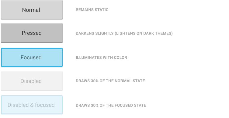
A StateListDrawable is a drawable object defined in XML that uses several different items to represent the same graphic, depending on the state of the object. For example, a Button widget can exist in one of several different states (pressed, focused, or neither) and, using a state list drawable, you can provide a different background image for each state. The state list supports different view states such as android:state_pressed, android:state_focused, android:state_enabled, android:state_selected, among many others. The illustration below shows all the major states that can be represented:
For example, a state list XML for a Button background might look like the following in a file such as res/drawable/selector_button_bg:
<?xml version="1.0" encoding="utf-8"?>
<selector
    xmlns:android="http://schemas.android.com/apk/res/android">
    <item
        android:state_pressed="true"
        android:state_enabled="true"
        android:drawable="@drawable/button_pressed" />
    <item
        android:state_focused="true"
        android:state_enabled="true"
        android:drawable="@drawable/button_focused" />
    <item
        android:state_enabled="true"
        android:drawable="@drawable/button_enabled" />
</selector>
Now, when the view (i.e Button) is pressed or focused, the drawable used for the view will change accordingly. Note that any view can have a state selector, but the most common uses are with Buttons and ListView items. There are also color state selectors which allow a color to be chosen based on view state such as in a file named res/color/button_text.xml:
<?xml version="1.0" encoding="utf-8"?>
<selector xmlns:android="http://schemas.android.com/apk/res/android">
    <item android:state_pressed="true" android:color="#ffff0000"/>
    <item android:state_focused="true" android:color="#ff0000ff"/>
    <item android:color="#ff000000"/>
</selector>
and applied to textColor property of a Button in a layout file:
<Button
    android:layout_width="match_parent"
    android:layout_height="wrap_content"
    android:text="@string/greeting"
    android:textColor="@color/button_text" />
Also we can use just shape. Define layer-list in res/drawable/button_gradient.xml.
<?xml version="1.0" encoding="utf-8"?>
<selector xmlns:android="http://schemas.android.com/apk/res/android">
    <item android:state_pressed="true">
        <shape>
            <gradient android:type="linear" android:endColor="#6699CC"
                android:startColor="#99CCFF" android:angle="90.0" />
            <corners android:radius="5.0dip" />
            <padding android:left="20dip" android:right="20dip" android:top="7dip" android:bottom="7dip"/>
        </shape>
    </item>
    <item>
        <shape>
            <gradient android:type="linear" android:endColor="#336699"
                android:startColor="#99CCFF" android:angle="90.0" />
            <corners android:radius="5.0dip" />
            <padding android:left="20dip" android:right="20dip" android:top="7dip" android:bottom="7dip"/>
        </shape>
    </item>
</selector>
Using state lists allows us to easily define dynamic views that respond to pressed, checked, enabled or other related states.
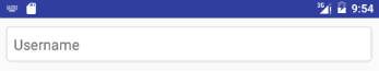
Following is example of use android:state_pressed for EditText.
Define selector in res/drawable/et_style.xml.
<?xml version="1.0" encoding="utf-8"?>
<selector xmlns:android="http://schemas.android.com/apk/res/android">
    <item android:state_pressed="true">
        <shape android:shape="rectangle">
            <corners android:radius="4dp" />
            <gradient android:startColor="#FF058bf5" android:endColor="#FF015ee6" android:angle="270" />
            <stroke android:width="2px" android:color="#E6E6E6" />
        </shape>
    </item>
    <item>
        <shape android:shape="rectangle">
            <corners android:radius="4dp"/>
            <solid android:color="#FFFFFFFF" />
            <stroke android:width="2px" android:color="#E6E6E6" />
        </shape>
    </item>
</selector>
In layout
<EditText
    android:id="@+id/et1"
    android:layout_width="fill_parent"
    android:layout_height="wrap_content"
    android:background="@drawable/triangle"
    android:hint="Username"
    android:padding="10dp" />
Layer List Drawables
A LayerDrawable is a drawable object that manages an array of other drawables. Each drawable in the list is drawn in the order of the list - the last drawable in the list is drawn on top. Each drawable is represented by an <item> element inside a single <layer-list> element.
The LayerList can be used to draw multiple other drawables (shapes, images, etc) and position them in relationship to one another. The layers are placed on top of one another by default with the last item being drawn on the top. Layers can then have their coordinates shifted using the left, right, top, and bottom properties.
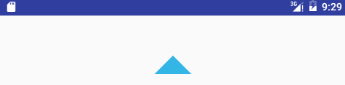
Android triangle
Create arrow_up.xml file in drawables directory with contents:
<?xml version="1.0" encoding="utf-8"?>
<layer-list xmlns:android="http://schemas.android.com/apk/res/android" >
    <item>
        <rotate
            android:fromDegrees="45"
            android:toDegrees="45"
            android:pivotX="-40%"
            android:pivotY="87%" >
            <shape
                android:shape="rectangle" >
                <stroke android:color="@android:color/transparent" android:width="10dp"/>
                <solid
                    android:color="@android:color/holo_blue_light" />
            </shape>
        </rotate>
    </item>
</layer-list>
The idea is to create rectangle shape (<shape/>), fill with gray solid color (<solid/>), rotate it 45 degrees (<rotate/>) and move it over X and Y axis (pivotX and pivotY) in a way that only half of the rectangle is visible (cut along the diagonal).
We also added thick border (<stroke/>) with transparent color. This is because our arrow is a Button, so the invisible part around is needed to ease the click (it enlarges click detection area size).
The usage is as simple as any other xml drawable shape. It is just enough to set it as view background. Here is Button example:
<Button
    android:layout_width="70dp"
    android:layout_height="70dp"
    android:background="@drawable/arrow_up" />
If you need arrow pointing in other direction, you can just rotate it. Here is arrow down:
<Button
    android:layout_width="70dp"
    android:layout_height="70dp"
    android:rotation="180"
    android:background="@drawable/arrow_up" />
Compared to png, icon is:
- scalable, because you can change its size as you wish, without providing bigger or smaller png files for each screen density. And there is no "pixelization" visible regardless of scale used.
- customizable, because you can easier adjust its color to better fit your UI or use it in other project – no need to regenerate png file and change it in project. Just change the xml attribute.
Card with shadow
A card is nothing more than a layout or a view with a background drawable. And that drawable can be defined in res/drawable/layer_card_background.xml XML as a layer drawable.
<?xml version="1.0" encoding="utf-8"?>
<layer-list xmlns:android="http://schemas.android.com/apk/res/android">
    <!-- bottom 2dp shadow -->
    <item>
        <shape android:shape="rectangle">
            <solid android:color="#CABBBBBB"/>
            <corners android:radius="2dp" />
        </shape>
    </item>

    <!-- white top color -->
    <item
        android:bottom="2dp">
        <shape android:shape="rectangle">
            <solid android:color="@android:color/white"/>
            <corners android:radius="2dp" />
        </shape>
    </item>
</layer-list>
The first item in the layer-list defines what will be the card's shadow. The second item in the layer-list is the main content for the card. You can turn any view or layout into a card by setting the background to the layer_card_background drawable.
<?xml version="1.0" encoding="utf-8"?>
<LinearLayout
   xmlns:android="http://schemas.android.com/apk/res/android"
   android:layout_width="match_parent"
   android:layout_height="match_parent"
   android:gravity="center"
   android:background="#E0EEEE">
   <TextView
      android:layout_width="wrap_content"
      android:layout_height="wrap_content"
      android:layout_gravity="center"
      android:gravity="center"
      android:layout_margin="15dp"
      android:padding="15dp"
      android:background="@drawable/layer_card_background"
      android:text="Lorem ipsum ..."/>
</LinearLayout>
TextView with border at top and bottom
Create an xml drawable such as res/drawable/textlines.xml and assign this as a TextView's background property.
In layout
<TextView
    android:layout_width="wrap_content"
    android:layout_height="wrap_content"
    android:text="My text with lines above and below"
    android:background="@drawable/textlines"/>
Define layer-list in res/drawable/textlines.xml.
<?xml version="1.0" encoding="utf-8"?>
<layer-list xmlns:android="http://schemas.android.com/apk/res/android" >
    <item>
        <shape android:shape="rectangle">
            <stroke android:width="1dp" android:color="#FF000000" />
            <solid android:color="#FFDDDDDD" />
        </shape>
   </item>

   <item android:top="1dp" android:bottom="1dp">
        <shape android:shape="rectangle">
            <stroke android:width="1dp" android:color="#FFDDDDDD" />
            <solid android:color="#00000000" />
        </shape>
   </item>
</layer-list>
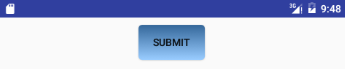
Button with border at bottom
Define layer-list in res/drawable/button_stroke.xml.
<?xml version="1.0" encoding="utf-8"?>
<layer-list xmlns:android="http://schemas.android.com/apk/res/android">
    <item>
        <shape android:shape="rectangle" >
            <solid android:color="#1bd4f6" />
        </shape>
    </item>

    <item android:top="-2dp" android:right="-2dp" android:left="-2dp">
        <shape>
            <solid android:color="@android:color/transparent" />
            <stroke
                android:width="1dp"
                android:color="#FF0000" />
        </shape>
    </item>
</layer-list>
In layout
<Button
    android:text="Submit"
    android:layout_width="wrap_content"
    android:layout_height="wrap_content"
    android:background="@drawable/button_stroke"/>
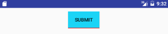
If you want to remove shadow for button add style="?android:attr/borderlessButtonStyle".
<Button
    android:text="Submit"
    android:layout_width="wrap_content"
    android:layout_height="wrap_content"
    android:background="@drawable/button_stroke"
    style="?android:attr/borderlessButtonStyle"/>
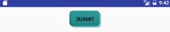
Button with shadow
In layout
<Button
    android:text="Submit"
    android:layout_width="wrap_content"
    android:layout_height="wrap_content"
    android:background="@drawable/shadow"/>
Define layer-list in res/drawable/shadow.xml.
<?xml version="1.0" encoding="utf-8"?>
<layer-list xmlns:android="http://schemas.android.com/apk/res/android" >
    <item
        android:bottom="4dp"
        android:right="4dp">
        <shape>
            <gradient
                android:angle="-90.0"
                android:endColor="#006666"
                android:startColor="#339999" />

            <corners android:radius="10dp" />
        </shape>
    </item>
    <item
        android:left="4dp"
        android:top="4dp">
        <shape>
            <solid android:color="#88339999" />
            <corners android:radius="10dp" />
        </shape>
    </item>
</layer-list>
Several shapes
The following layer list draws several shapes in relation to each other:
<?xml version="1.0" encoding="utf-8"?>
<layer-list xmlns:android="http://schemas.android.com/apk/res/android" >
    <item>
        <shape android:shape="rectangle">
            <size android:width="280dp" android:height="140dp"/>
            <stroke android:width="1dp" android:color="#585858" />
            <solid android:color="#FF9009" />
            <padding android:bottom="1dp"/>
        </shape>
   </item>
   <item android:left="10dp" android:top="20dp" android:bottom="20dp" android:right="150dp">
      <shape android:shape="oval">
            <stroke android:width="1dp" android:color="#ffffff" />
            <solid android:color="#118C4E" />
            <padding android:bottom="1dp"/>
        </shape>
   </item>
   <item android:left="150dp" android:top="20dp" android:bottom="20dp" android:right="10dp">
      <shape android:shape="rectangle">
            <stroke android:width="1dp" android:color="#ffffff" />
            <solid android:color="#C1E1A6" />
            <padding android:bottom="1dp"/>
        </shape>
   </item>
</layer-list>
In layout
<View
    android:layout_width="300dp"
    android:layout_height="170dp"
    android:background="@drawable/shape2"/>
and this results in the following:
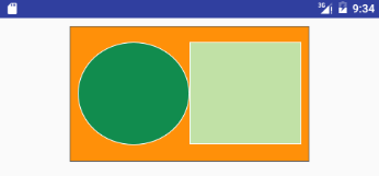
Keep in mind that the items in a LayerList can also be images or any other type of drawable. You can use this to create more complex drawings and overlay multiple drawables on top of each other.
Nine-Patch Drawables
A NinePatch is a PNG image in which you can define stretchable regions that are stretched when the content within the View exceeds the normal image bounds. You typically assign this type of image as the background of a View which has its width set to wrap_content. The most common use is a Button that has to stretch based on the text displayed inside.
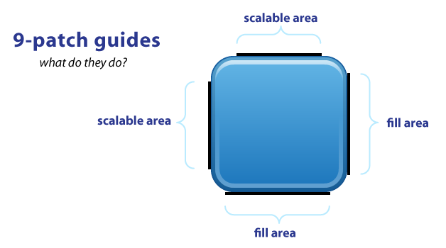 |
 |
As you can see, you have guides on each side of your image. The top and left guides are for scaling your image, while the right and bottom guides define the fill area. The top and left guides are used to define the scalable portion of your image - left for scaling height, top for scaling width. Using a Button image as an example, this means the Button can stretch horizontally and vertically within the black portion and everything else, such as the corners, will remain the same size.
So, a valid nine-patch image file is simply a PNG image in which the outer 1 pixel contains only either black or transparent pixels. The black pixels on each side define something about how the image will stretch and wrap the content inside:
- Left side. Black pixels here define areas where the image should stretch vertically. The pixels in these areas will be stepped and repeated to accomplish the stretch.
- Top side. Black pixels here define areas where the image should stretch horizontally. The pixels in these areas will be stepped and repeated to accomplish the stretch.
- Right side. Black pixels here define the vertical content area, which is the area where the view’s content will display. In effect, it is defining the top and bottom padding values, but inherent to the background image. • Bottom side. Black pixels here define the horizontal content area, which is the area where the view’s content will display. In effect, it is defining the left and right padding values, but inherent to the background image. This must contain a single line of solid pixels defining the area.
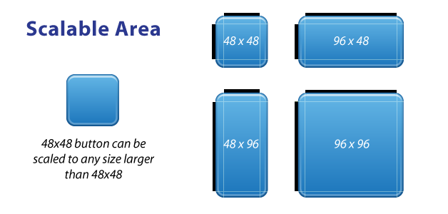
The black guide lines are cut-off/removed from your image - they won't show in the app. Guides must only be one pixel wide, so if you want a 48x48 button, your png will actually be 50x50. Anything thicker than one pixel will remain part of your image. Your guides must be solid black (#000000). Also you should keep in mind that remaining area of the one-pixel outline must be completely transparent. This includes the four corners of the image - those should always be clear.
Fill area guides are optional and provide a way define the area for stuff like your text label. Fill determines how much room there is within your image to place text, or an icon, or other things.
NinePatch are images that have a .9.png file extension, which signifies that this is a stretchable PNG image. The file is no different from a normal PNG file except that you will add thin black lines to indicate the vertical and horizontal "stretchable" and "fill" areas for the image. Android will not show these guide lines, which are used to determine how the image should be rendered.
An example of a 9-patch image is embedded below (left is the 9patch graphic, right is an example of use in an app):
 |
 |
A NinePatch is defined and saved in the drawable folder and setting the background works the same as with any image:
<Button
    android:layout_width="wrap_content"
    android:layout_height="wrap_content"
    android:text="Submit"
    android:background="@drawable/button_background"/>
Android Studio comes with the ability to edit 9-patch files directly. Your PNG file simply needs to be saved with the .9.png extension in the drawable folder, and the 9-patch editor will display instead of the normal image editor. You can use the mouse to select the regions to be stretched (use Shift and click while dragging the mouse to erase the region), and the preview pane on the right displays how images will be rendered depending on the text inside.
Transition Drawables
Transition Drawables allow to define transitions which lets us display a smooth cross-fade effect between two pictures, for example.
Firstly, we'll need to add 2 pictures to the drawable directory of the project. In my case, they are cat1.jpg and cat2.jpg, and I put both of them in res/drawable-hdpi/ directory.
Add an xml file in the same directory, call it transition.xml. Here we will add a transition node with 2 item nodes inside, each representing an image:
<?xml version="1.0" encoding="utf-8"?>
<transition xmlns:android="http://schemas.android.com/apk/res/android">
    <item android:drawable="@drawable/cat1" />
    <item android:drawable="@drawable/cat2" />
</transition>
Now go to activity_main.xml layout file. Add an ImageView, set its source to the first image:
<LinearLayout
    xmlns:android="http://schemas.android.com/apk/res/android"
    xmlns:tools="http://schemas.android.com/tools"
    android:layout_width="match_parent"
    android:layout_height="match_parent"
    android:orientation="vertical">

    <ImageView
        android:id="@+id/ivCat"
        android:layout_width="match_parent"
        android:layout_height="match_parent"
        android:src="@drawable/cat1"/>
</LinearLayout>
When that's done, go to MainActivity.java class and declare 2 variables - instances of ImageView and TransitionDrawable.
private ImageView ivCat;
private TransitionDrawable trans;
In the onCreate() function of the Activity, set the image value to the ImageView we declared in activity_main.xml. Set trans value to the transition resource we created in the drawable directory:
image = (ImageView)findViewById(R.id.ivCat);
Resources res = this.getResources();
trans = (TransitionDrawable) res.getDrawable(R.drawable.transition);
Now add a click listener to the ImageView object. In the event of a click, use the setImageDrawable() method to apply the transition resource to the image. Then we call the reverseTransition() method of the transition, passing 1000 as the parameter, which is the effect time.
ivCat.setOnClickListener(new OnClickListener() {
    @Override
    public void onClick(View v) {
        ivCat.setImageDrawable(trans);
        trans.reverseTransition(1000);
    }
});
Instead of reverseTransition(), you can call startTransition(), which always starts with the first layer fading out and the second layer fading it. The reverseTransition() method handles the transition both ways.
Level List
Using level list drawable, drawable attributes of a view can be set to deferent drawables at run time by calling setLevel on Drawable object and passing level value to it. The level value points to a drawable in the level list drawable.
You can define level list drawable xml with different drawable items setting max and min values for each drawable. At run time, depending on the value passed to setLevel method, a drawable from the level drawable list will be picked and displayed.
Below example defines level list xml with three dawable items with different levels and level ranges. On clicking a button, level is incremented by calling setLevel on Drawable that will make it show corresponding drawable from the level list. Every time the button is clicked, image will be changed to reflect level value.
Drawable
<?xml version="1.0" encoding="utf-8"?>
<level-list xmlns:android="http://schemas.android.com/apk/res/android" >
    <item
        android:drawable="@drawable/square_red"
        android:maxLevel="0" />
    <item
        android:drawable="@drawable/square_blue"
        android:maxLevel="1" />
    <item
        android:drawable="@drawable/square_green"
        android:minLevel="2"
        android:maxLevel="4"/>
</level-list>
Layout xml
<LinearLayout
    xmlns:android="http://schemas.android.com/apk/res/android"
    xmlns:app="http://schemas.android.com/apk/res-auto"
    android:orientation="vertical"
    android:layout_margin="8dp"
    android:layout_width="match_parent"
    android:layout_height="match_parent">
    <ImageView
        android:id="@+id/img"
        android:layout_width="wrap_content"
        android:layout_height="wrap_content"
        android:src="@drawable/level_list"/>
    <Button
        android:id="@+id/button"
        android:layout_width="wrap_content"
        android:layout_height="wrap_content"
        android:layout_marginRight="10dp"
        android:text="Button"/>
</LinearLayout>
Activity
public class MainActivity extends AppCompatActivity {
    private int levelInt = 0;
    private ImageView img;
    private Drawable drawable;

    @Override
    protected void onCreate(Bundle savedInstanceState) {
        super.onCreate(savedInstanceState);
        setContentView(R.layout.main_activity);

        drawable = getResources().getDrawable(R.drawable.level_list);
        img = findViewById(R.id.img);

        findViewById(R.id.button).setOnClickListener(new View.OnClickListener() {
            @Override
            public void onClick(View view) {
                if (levelInt >= 4){
                    levelInt = 0;
                } else {
                    levelInt++;
                }
                drawable.setLevel(levelInt);
                img.setImageDrawable(drawable);
                img.refreshDrawableState();
            }
        });
    }
}
Scale Drawable
Using scale drawable, you can specify how a drawable can be scaled depending on the level by setting scale height, scale width and scale gravity. Below is an example scale drawable which is displayed in image view. On clicking a button, the drawable’s level will be increased by calling setLevel and passing level. As the level increases, the drawable that is displayed in ImageView will scale.
Drawable
<?xml version="1.0" encoding="utf-8"?>
<scale xmlns:android="http://schemas.android.com/apk/res/android"
    android:drawable="@drawable/zoftino"
    android:scaleGravity="center_vertical|center_horizontal"
    android:scaleHeight="60%"
    android:scaleWidth="60%" />
Activity
img = findViewById(R.id.img);
findViewById(R.id.button).setOnClickListener(new View.OnClickListener() {
    @Override
    public void onClick(View view) {
        ScaleDrawable drawable = (ScaleDrawable) img.getDrawable();
        levelInt = levelInt +800;
        drawable.setLevel(levelInt);
    }
});
Quote
Categories
- Android
- AngularJS
- Databases
- Development
- Django
- iOS
- Java
- JavaScript
- LaTex
- Linux
- Meteor JS
- Python
- Science
Archive ↓
- September 2024
- December 2023
- November 2023
- October 2023
- March 2022
- February 2022
- January 2022
- July 2021
- June 2021
- May 2021
- April 2021
- August 2020
- July 2020
- May 2020
- April 2020
- March 2020
- February 2020
- January 2020
- December 2019
- November 2019
- October 2019
- September 2019
- August 2019
- July 2019
- February 2019
- January 2019
- December 2018
- November 2018
- August 2018
- July 2018
- June 2018
- May 2018
- April 2018
- March 2018
- February 2018
- January 2018
- December 2017
- November 2017
- October 2017
- September 2017
- August 2017
- July 2017
- June 2017
- May 2017
- April 2017
- March 2017
- February 2017
- January 2017
- December 2016
- November 2016
- October 2016
- September 2016
- August 2016
- July 2016
- June 2016
- May 2016
- April 2016
- March 2016
- February 2016
- January 2016
- December 2015
- November 2015
- October 2015
- September 2015
- August 2015
- July 2015
- June 2015
- February 2015
- January 2015
- December 2014
- November 2014
- October 2014
- September 2014
- August 2014
- July 2014
- June 2014
- May 2014
- April 2014
- March 2014
- February 2014
- January 2014
- December 2013
- November 2013
- October 2013