Understanding configuration qualifier names Android 19.04.2017
In Android, almost everything is a resource. Resources are used for anything from defining colors, images, layouts, menus, and string values. The value of this is that nothing is hardcoded. Everything is defined in these resource files and then can be referenced within your application's code.
Since it is not always possible to develop a single design that will scale to fit every screen size, density, and orientation, Android OS provides us with the ability to create our own resource folder (/res) layout subfolder names, so that we can provide custom UI designs for different screen sizes and orientations. Android looks at our user’s screen characteristics at run-time, and selects the correct UI design, based on layout folder naming.
The following are the most common types of resources within Android apps
| Name | Folder | Description |
|---|---|---|
| Property Animations | animator | XML files that define property animations. |
| Tween Animations | anim | XML files that define tween animations. |
| Drawables | drawable | Bitmap files or XML files that act as graphics |
| Layout | layout | XML files that define a user interface layout |
| Menu | menu | XML files that define menus or action bar items |
| Values | values | XML files with values such as strings, integers, and colors. |
In addition, note the following key files stored within the values folder mentioned above:
| Name | File | Description |
|---|---|---|
| Colors | res/values/colors.xml |
For color definitions such as text color |
| Dimensions | res/values/dimens.xml |
For dimension values such as padding |
| Strings | res/values/strings.xml |
For string values such as the text for a title |
| Styles | res/values/styles.xml |
For style values such as color of the AppBar |
For the full list of resource types, check out the Providing a Resource guide.
There are four important rules to remember when creating alternative resources:
- The Android platform always loads the most specific, most appropriate resource available. If an alternative resource does not exist, the default resource is used. Therefore, it’s important to know your target devices, design for the defaults, and add alternative resources judiciously in order to keep your projects manageable.
- Alternative resources must always be named exactly the same as the default resources and stored in the appropriately named directory, as dictated by a special alternative resource qualifier. If a string is called
strHelpTextin the/res/values/strings.xmlfile, it must be named the same in the/res/values-fr/strings.xml(French) and/res/values-zh/strings.xml(Chinese) string files. The same goes for all other types of resources, such as graphics or layout files. - Good application design dictates that alternative resources should almost always have a default counterpart so that regardless of the device configuration, some version of the resource will always load. The only time you can get away without a default resource is when you provide every kind of alternative resource. One of the first steps the system takes when finding a best matching resource is to eliminate resources that are contradictory to the current configuration. For example, in portrait mode, the system would not even attempt to use a landscape resource, even if that is the only resource available. Keep in mind that new alternative resource qualifiers are added over time, so although you might think your application provides complete coverage of all alternatives now, it might not in the future.
- Don’t go overboard creating alternative resources because they add to the size of your application package and can have performance implications. Instead, try to design your default resources to be flexible and scalable. For example, a good layout design can often support both landscape and portrait modes seamlessly - if you use appropriate layouts, user interface controls, and scalable graphics resources.
The following list gives the qualifiers you can use to customize your resource values:
- Mobile Country Code and Mobile Network Code (MCC/MNC). The country, and optionally the network, associated with the SIM currently used in the device. The MCC is specified by
mccfollowed by the three-digit country code. You can optionally add the MNC usingmncand the two- or three-digit network code (for example,mcc234-mnc20ormcc310). - Language and Region. Language specified by the lowercase two-letter ISO 639-1 language code, followed optionally by a region specified by a lowercase
rfollowed by the uppercase two-letter ISO 3166-1-alpha-2 language code (for example,en,en-rUS, oren-rGB). - Smallest Screen Width. The lowest of the device’s screen dimensions (height and width) specified in the form
sw<dimension value>dp(for example,sw600dp,sw320dp, orsw720dp). This is generally used when providing multiple layouts, where the value specified should be the smallest screen width that your layout requires in order to render correctly. Where you supply multiple directories with different smallest screen width qualifiers, Android selects the largest value that doesn’t exceed the smallest dimension available on the device. The-sw600dpconfiguration qualifier lets you provide resources only when a device is above a certain size. The sw stands for smallest width, but refers to the screen’s smallest dimension, and thus is independent of the device’s current orientation. With a-sw600dpqualifier, you are saying, Use this resource on any device whose smallest dimension is 600dp or greater. This is a good rule of thumb for specifying a tablet-sized screen. - Available Screen Width. The minimum screen width required to use the contained resources, specified in the form
w<dimension value>dp(for example,w600dp,w320dp, orw720dp). Also used to supply multiple layouts alternatives, but unlike smallest screen width, the available screen width changes to reflect the current screen width when the device orientation changes. Android selects the largest value that doesn’t exceed the currently available screen width. For example,-w600dpwill match any device where the current available screen width is 600dp or more, meaning a device may match when in landscape mode but not in portrait mode. Available Screen Height. The minimum screen height required to use the contained resources, specified in the formh<dimension value>dp(for example,h720dp,h480dp, orh1280dp). Like available screen width, the available screen height changes when the device orientation changes to reflect the current screen height. Android selects the largest value that doesn’t exceed the currently available screen height. For example, a 640dp x 480dp screen has a height of 640dp when in portrait and 480dp when in landscape.- Screen Size. One of small (smaller than HVGA), medium (at least HVGA and typically smaller than VGA), large (VGA or larger), or xlarge (signifi cantly larger than HVGA). Because each of these screen categories can include devices with significantly different screen sizes (particularly tablets), it’s good practice to use the more specific smallest screen size, and available screen width and height whenever possible. Because they precede this screen size qualifier, where both are specified, the more specific qualifiers will be used in preference where supported.
- Screen Aspect Ratio. Specify
longornotlongfor resources designed specifi cally for wide screen. For example, WVGA is long; QVGA is notlong. - Screen Orientation. One of port (
portrait), land (landscape), or square (square). - Dock Mode. One of
carordesk. Introduced in API level 8. - Night Mode. One of
night(night mode) ornotnight(day mode). Introduced in API level 8. Used in combination with the dock mode qualifier, this provides a simple way to change the theme and/or color scheme of an application to make it more suitable for use at night in a car dock. - Screen Pixel Density. Pixel density in dots per inch (dpi). Best practice is to supply
ldpi,mdpi,hdpi, orxhdpito specify low (120 dpi), medium (160 dpi), high (240 dpi), or extra high (320 dpi) pixel density assets, respectively. You can specifynodpifor bitmap resources you don’t want scaled to support an exact screen density. To better support applications targeting televisions running Android, you can also use thetvdpiqualifier for assets of approximately 213dpi. This is generally unnecessary for most applications, where including medium- and high-resolution assets is suffi cient for a good user experience. Unlike with other resource types, Android does not require an exact match to select a resource. When selecting the appropriate folder, it chooses the nearest match to the device’s pixel density and scales the resulting Drawables accordingly. - Touchscreen Type. One of
notouch,stylus, orfinger, allowing you to provide layouts or dimensions optimized for the style of touchscreen input available on the host device. - Keyboard Availability. One of
keysexposed,keyshidden, orkeyssoft. - Keyboard Input Type. One of
nokeys,qwerty, or12key. - Navigation Key Availability. One of
navexposedornavhidden. - UI Navigation Type. One of
nonav,dpad,trackball, orwheel. - Platform Version. The target API level, specified in the form
v<API Level> (for example,v7). Used for resources restricted to devices running at the specified API level or higher.
You can specify multiple qualifiers for a single set of resources, separated by dashes. For example, drawable-en-sw600dp-land applies to English tablets in landscape orientation. Note that if you use multiple qualifiers for a resource directory, you must add them to the directory name in the certain order. See the official docs for the complete set of qualifiers available.
Details for Screen Pixel Density qualifiers
Before continue, read about Android screen densities. You'll know about difference between DPI and DP.
Imagery (drawable) assets use a different resource qualifier folder naming schema, under the /res/drawable folder, and use the -ldpi and -hdpi naming extensions, instead of those -small and -large naming extensions that the layout folder resource qualifier naming schema utilizes.
For example, one best practice is to ensure that all images are provided for multiple screen densities.
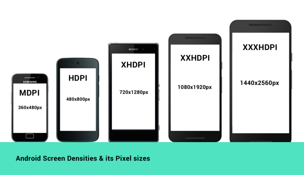
Density Classes
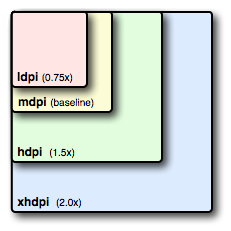
| Density | DPI | Example Device | Scale | Pixels |
|---|---|---|---|---|
| ldpi | 120 | Galaxy Y | 0.75x | 1dp = 0.75px |
| mdpi | 160 | Galaxy Tab | 1.0x | 1dp = 1px |
| hdpi | 240 | Galaxy S II | 1.5x | 1dp = 1.5px |
| xhdpi | 320 | Nexus 4 | 2.0x | 1dp = 2px |
| xxhdpi | 480 | Nexus 5 | 3.0x | 1dp = 3px |
| xxxhdpi | 640 | Nexus 6 | 4.0x | 1dp = 4px |
What do all these letters and numbers mean to you? A given image will appear larger on a screen with a lower density and smaller on a screen with a higher density. If you take a piece of paper and draw a vertical line and a horizontal line, splitting it into four pieces, a single piece (pixel) will take up a quarter of the paper. If you divide each of those quarters into four pieces, then a single piece (pixel) is one fourth of the size that it was. The pixel appears physically smaller even though the total size of the paper (the screen) has not changed.
Fortunately, Android makes handling this easy for you. Instead of specifying dimensions in raw pixels, you will use either density-independent pixels (referred to as dip or dp) or scale-independent pixels (sip or sp). Density-independent pixels are based on MDPI, so 1dp is 1px at medium density. The difference between one sp and one dp is that sp takes into account the user’s preferred font size. Therefore, all font sizes should be specified in sp and all other dimensions should be in dp.
You can find DPI for different devices at dpi.lv.
Screen Size Classes
| Class | Size in dp | Layout Folder | Examples |
|---|---|---|---|
| small | 426x320 dp | layout-small | typical phone screen (240x320 ldpi, 320x480 mdpi, etc.) |
| normal | 470x320 dp | layout-normal OR layout | typical phone screen (480x800 hdpi) |
| large | 640x480 dp | layout-large | tweener tablet like the Streak (480x800 mdpi), 7" tablet (600x1024 mdpi) |
| xlarge | 960x720 dp | layout-xlarge | 10" tablet (720x1280 mdpi, 800x1280 mdpi, etc.) |
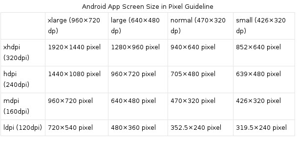
This means that if you generate a 100x100 for mdpi (1x baseline), then you should generate the same resource in 150x150 for hdpi (1.5x), 200x200 image for xhdpi devices (2.0x), 300x300 image for xxhdpi (3.0x) and a 75x75 image for ldpi devices (0.75x).
This is achieved by having res/drawable-hdpi, res/drawable-xhdpi, and res/drawable-xxhdpi folders with different versions of the same image. The correct resource is then selected automatically by the system based on the device density.
If you are developing for Android 3.2 and earlier and don’t need a precise DIP screen resolution control qualifier you can utilize the /res/layout-small resource qualifier for your small screen layouts and the /res/layout-large resource qualifier for your large screen layouts. There’s also a /res/layout-xlarge resource qualifier folder name that you can use, for extra large screen UI layouts, for instance on iTV sets, large tablets, PCs, netbooks, or notebooks.
If you wanted to specify a portrait UI layout for any of these non-normal-size resource qualifier names, you would then add -port to the end of your folder name. Thus, if you had a small screen portrait UI design, you would have that design in a specially named /res/layout-small-port folder. It is important to note that the -port must always come after the size modifier.
If you wanted to specify landscape UI layouts for any of these non-normal−sized resource qualifier names, you would then add -land to the end of your folder name. Thus if you had a large screen landscape UI design, you would have that design in a specially named /res/layout-large-land folder. It is important to note that the -land must always come after the size modifier.
Normal, also known as medium-sized screen layout designs, do not require a resource qualifier. These UI designs would be kept in the root UI layout folder, or the /res/layout folder, and this "primary" or default UI design would also define the name use for the other files in the other folders.
Sometimes it's a good idea to create image with grid and check view zone on all available devices. For this you can use proportion calculator and gradient maker with steps.
Useful for designer
Following is a list of resources for different devices' density (in pixels).
| ldpi | mdpi | hdpi | xhdpi | xxhdpi | xxxhdpi | |
|---|---|---|---|---|---|---|
| Launcher And Home | 36*36 | 48*48 | 72*72 | 96*96 | 144*144 | 192*192 |
| Toolbar And Tab | 24*24 | 32*32 | 48*48 | 64*64 | 96*96 | 128*128 |
| Notification | 18*18 | 24*24 | 36*36 | 48*48 | 72*72 | 96*96 |
| Background | 240*320 | 320*480 | 480*800 | 768*1280 | 1080 *1920 | 1440*2560 |
Details for Smallest Width, Available Width, Available Height qualifiers
Android 3.2 changed how screen size resource qualifiers were defined, by adding three different DIP size based resource qualifiers: SmallestWidth, which is written as -sw###dp, or -sw480dp, for instance, AvailableWidth, as indicated using a -w###dp, or -w600dp for instance, and AvailableHeight, as indicated using a -h###dp, or -h720dp for instance.
What these do is to give the developer a much finer numeric control over a given UI design to screen characteristics pairing. With the small, medium, large, and xlarge resource qualifiers, developers had to rely on Android to determine what screen resolutions qualify for these general categories. A screen size specific resource qualifier allows for a pixel-precision value to be set by the developer, so there is zero guesswork as to what design will be used with any given physical screen resolution characteristics.
The SmallestWidth or -sw modifier looks at the smallest possible dimension of the screen, regardless of its orientation, which makes it significantly different from an AvailableWidth or -w modifier, which will change numeric value evaluation within the OS every time that a user changes their device orientation. The same goes for the AvailableHeight, or -h modifier.
SmallestWidth is used to determine whether enough DIP width is available for your UI design regardless of the orientation of the device. The most common dimension for an Android screen is 480 pixels, which is -sw480dp and is found in devices with 320x480, 480x800, and 480x854 resolution screens. The next most common is 800 pixels, common in 480x800 and 800x1280 screen size devices, such as smartphones and tablets.
Now that smartwatches such as the Samsung Galaxy Gear are becoming popular, 320 pixel devices like a 320x320 Galaxy Gear or 320x480 entry-level touchscreen smartphone will also become a popular resolution, so a -sw320dp, -sw480dp, and -sw800dp qualifier will also be used quite frequently by Android developers.
Some popular resolutions have only one resolution out there, such as the 1024x600 netbook resolutions, which use a -sw600dp qualifier, and the Pseudo HD 1280x720 resolution, which uses a -sw720dp qualifier.
It is important to note that the SmallestWidth calculation algorithm that is implemented by the Android OS takes into account any system chrome, that is, any Android OS UI elements such as status bars and bottom mounted virtual control button bars. This means the SmallestWidth algorithm won’t match the physical screen resolution, but rather the available resolution that can be used to contain your parent UI ViewGroup layout container.
The SmallestWidth -sw###dp qualifier can be used in conjunction with a -port and a -land qualifier, such as /res/layout-sw480dp-land to allow developer control over UI design for any screen size and orientation. This allows a developer precise control over not only how their UI fits any device, but also over how digital image or digital video content is displayed.
The other two -w###dp and -h###dp resource qualifiers re-evaluate for any orientation change for a user’s Android device, so the resource qualifiers can be used to replace Java code that detects device orientation changes, and then implements a different UI design or even content design paradigm.
Since these -w###dp and -h###dp qualifiers can be used to determine one screen axis resolution, and since this changes with device orientation, you could use them with a -port and -land qualifier to match any popular resolution.
For instance -w480dp on its own would call both a 320x480 resolution entry level smartphone, when it is in landscape orientation, and also an 480x800 or 854x480 smartphone or tablet when it’s in portrait orientation. To also control which of these device scenarios you are matching your UI design to you can add -port and -land, so to fit a 320x480 entry-level (inexpensive) smartphone use -w320dp-port and use -w480dp-port to fit 800x480 or 854x480 smartphones or tablets when they are being used in portrait mode. It would be cool to be able to use these two together to specify a complete display screen resolution, but because they are in the same category this can’t be done currently. Luckily, it is just as effective, that is, you can achieve the same result, by using the size and orientation qualifiers together.
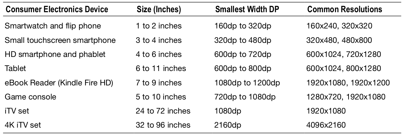
Following table shows some of the different types of Android devices and the DIP (or DP) screen size ranges, typical resolution and smallest width normally associated with each type of device.
It is also possible to restrict your applications to only run on devices that support certain screen size, density, and resolution characteristics. This is done by using an "analog" or equivalent of the resource qualifier that you just learned about (Smallest Width). This XML parameter is used inside the <supports-screens> tag, which is a child tag of your parent <manifest> tag for your application manifest.
The parameter is the android:requiresSmallestWidthDp parameter, which does the same thing as the -sw###dp resource qualifier, so it looks at the smaller of the two X:Y or W:H screen dimensions, and uses the tag format:
<supports-screens android:requiresSmallestWidthDp="720" />
Determining configuration at runtime
When the app is running, we can always check the current configuration (orientation, screen size, etc) by accessing the Configuration object through getResources().getConfiguration() within an activity or context object. For example, to determine the orientation (portrait or landscape) inside an activity, we can do:
String image;
int orientation = getResources().getConfiguration().orientation;

if (orientation == Configuration.ORIENTATION_PORTRAIT) {
   image = "image_portrait.png";
} else if (orientation == Configuration.ORIENTATION_LANDSCAPE) {
   image = "image_landscape.png";
}
We can similarly access this within any object by getting access to a Context object. For example, within an ArrayAdapter by using getContext().getResources().getConfiguration() to access the configurations.
You can get screen size in dp with following
DisplayMetrics displayMetrics;
displayMetrics = new DisplayMetrics();
WindowManager windowManager = (WindowManager) ctx.getSystemService(Context.WINDOW_SERVICE);
windowManager.getDefaultDisplay().getMetrics(displayMetrics);
int height = Math.round(displayMetrics.heightPixels / displayMetrics.density);
int width = Math.round(displayMetrics.widthPixels / displayMetrics.density);
Log.d(TAG, width + "x" + height);
Layout aliases
There is one final concept to discuss when creating universal application UIs, and that is layout aliases. Often the same layout should be used for multiple device configurations, but chaining multiple resource qualifiers together (such as a smallest width qualifier and a traditional size qualifier) on the same resource directory can be problematic. This can often lead developers to create multiple copies of the same layout in different directories, which is a maintenance nightmare.
We can solve this problem with aliasing. By creating a single layout file in the default resource directory, we can create multiple aliases to that single file in resource-qualified values directories for each configuration that uses the layout. The following snippet illustrates an alias to the res/layout/main_tablet.xml file:
<resources>
<item name="main" type="layout">@layout/main_tablet</item>
</resources>
The name attribute represents the aliased name, which is the resource this alias is meant to represent in the selected configuration. This alias links the main_tablet.xml file to be used when R.layout.main is requested in code. This code could be placed into res/values-xlarge/layout.xml and res/values-sw720dp/layout.xml, and both configurations would link to the same layout.
Useful links
Quote
Categories
- Android
- AngularJS
- Databases
- Development
- Django
- iOS
- Java
- JavaScript
- LaTex
- Linux
- Meteor JS
- Python
- Science
Archive ↓
- September 2024
- December 2023
- November 2023
- October 2023
- March 2022
- February 2022
- January 2022
- July 2021
- June 2021
- May 2021
- April 2021
- August 2020
- July 2020
- May 2020
- April 2020
- March 2020
- February 2020
- January 2020
- December 2019
- November 2019
- October 2019
- September 2019
- August 2019
- July 2019
- February 2019
- January 2019
- December 2018
- November 2018
- August 2018
- July 2018
- June 2018
- May 2018
- April 2018
- March 2018
- February 2018
- January 2018
- December 2017
- November 2017
- October 2017
- September 2017
- August 2017
- July 2017
- June 2017
- May 2017
- April 2017
- March 2017
- February 2017
- January 2017
- December 2016
- November 2016
- October 2016
- September 2016
- August 2016
- July 2016
- June 2016
- May 2016
- April 2016
- March 2016
- February 2016
- January 2016
- December 2015
- November 2015
- October 2015
- September 2015
- August 2015
- July 2015
- June 2015
- February 2015
- January 2015
- December 2014
- November 2014
- October 2014
- September 2014
- August 2014
- July 2014
- June 2014
- May 2014
- April 2014
- March 2014
- February 2014
- January 2014
- December 2013
- November 2013
- October 2013