Charts in R by usage Science 03.12.2016
Every data mining project is incomplete without proper data visualization. From a functional point of view, the following are the graphs and charts which a data scientist would like the audience to look at to infer the information:
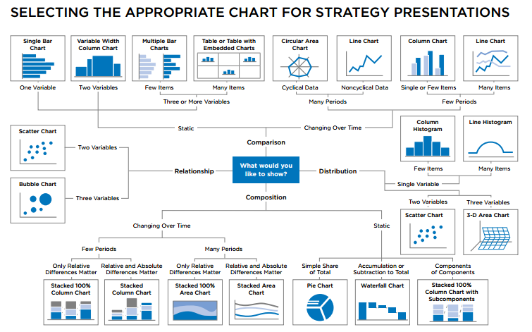
There is simple diagram with suggests how to choose the right chart for presentation
Let's initiate data and colors
dataX <- sample(1:50, 20, replace=T)
dataY <- sample(1:50, 20, replace=T)
dataZ <- sample(1:5, 20, replace=T)

palette <- c("#1f77b4", '#ff7f0e', '#2ca02c', '#d62728', '#9467bd', '#8c564b', '#e377c2')
c1 = palette[1]
c2 = palette[2]
c3 = palette[3]
c4 = "#FFFFF"
Comparisons between variables
Basically, when it is needed to represent two or more properties within a variable, then the following charts are used:
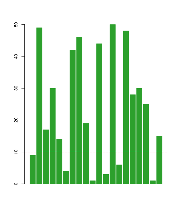
A bar plot is a chart with rectangular bars with lengths proportional to the values that they represent. The bars can be plotted either vertically or horizontally. A simple bar chart can be created in R with the barplot function. In the example below, data from the sample "pressure" dataset is used to plot the vapor pressure of Mercury as a function of temperature.
barplot(dataX, border=c3, col=c3)

# change font size
barplot(dataX, border=c3, col=c3, cex.axis=0.9, names.arg = dataX)

# plot line
abline(h=10, col="Red", lty=5)
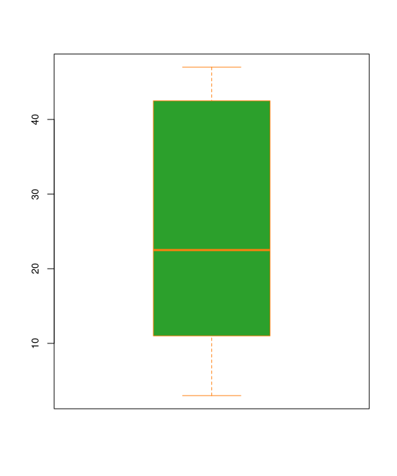
A box plot is a chart that illustrates groups of numerical data through the use of quartiles. A simple box plot can be created in R with the boxplot function.
boxplot(dataX, border=c2, col=c3, cex.axis=0.9)
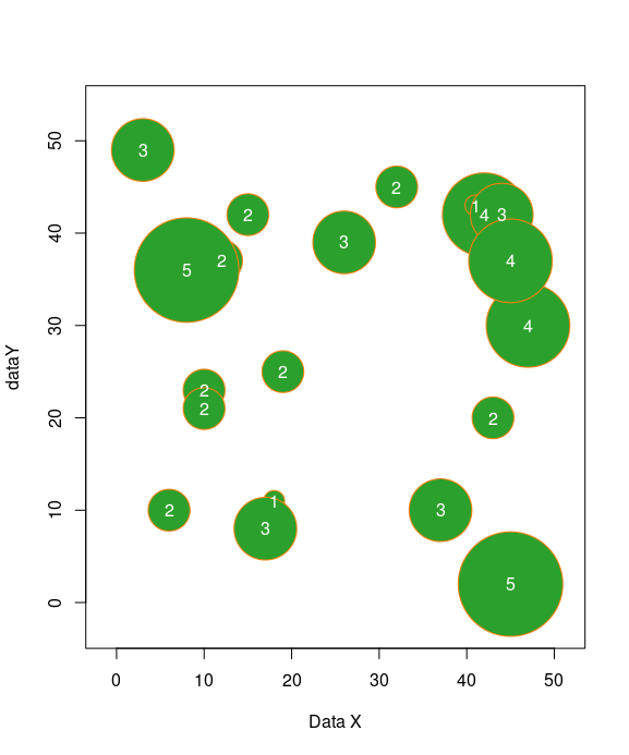
The bubble chart is a variant of the scatterplot. Like in the scatterplot, points are plotted on a chart area (typically an x-y grid). Two quantitative variables are mapped to the x and y axes, and a third quantitative variables is mapped to the size of each point.
symbols(dataX, dataY, circles=dataZ, fg=c2, bg=c3, inches=0.5, xlab="Data X")
text(dataX, dataY, dataZ, col=c4)
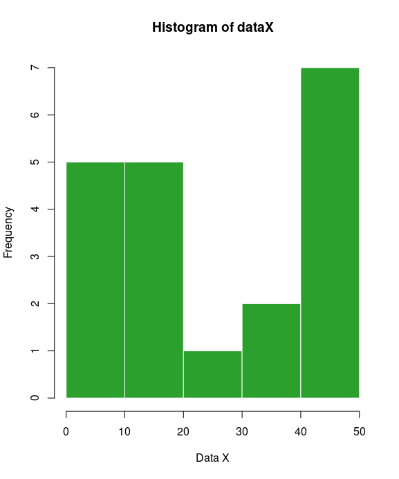
A histogram is a graphical representation of the distribution of data. A histogram represents the frequencies of values of a variable bucketed into ranges. Each bar in histogram represents the height of the number of values present in that range.
It allows you to easily see where a relatively large amount of the data is situated and where there is very little data to be found. In other words, you can see where the middle is in your data distribution, how close the data lie around this middle and where possible outliers are to be found. A simple histogram chart can be created in R with the hist function.
hist(dataX, border=c4, col=c3, xlab="Data X")

# add grid
grid()
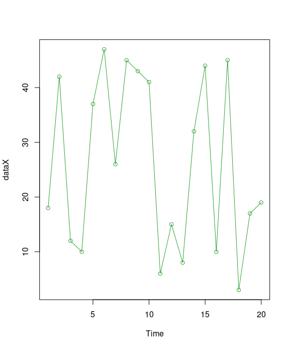
A line chart is a graph that connects a series of points by drawing line segments between them. These points are ordered in one of their coordinate (usually the x-coordinate) value. Line charts are usually used in identifying the trends in data, thus the line is often drawn chronologically. The plot() function in R is used to create the line graph.
plot(dataX, type="o", col=c3, xlab="Time")
legend("bottomleft", title="DataX vs Time", legend=c("data and time"), fill=c3, horiz=T, bty="n")
Single character defines the type of line chart to be plotted.
- p = Points
- l = Line
- b = Lines and Points
- o = Overplotted
- h = "Histogram like" lines
- s = Steps
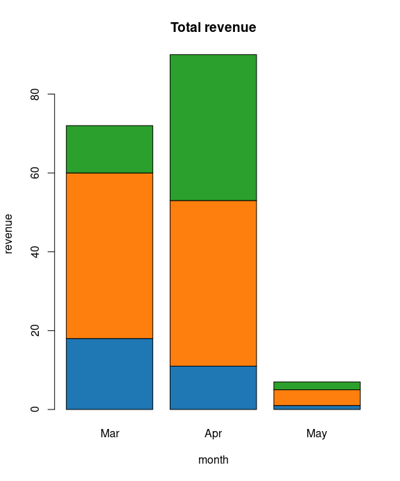
Stacked Barplots, or graphs that depict conditional distributions of data, are great for being able to see a level-wise breakdown of the data. We can create bar chart with groups of bars and stacks in each bar by using a matrix as input values.
More than two variables are represented as a matrix which is used to create the group bar chart and stacked bar chart.
months = c("Mar","Apr","May")
dd = data.frame(v1=dataX, v2=dataY, v3=dataZ)
mm = as.matrix(dd)
barplot(mm[1:3,], main = "Total revenue", names.arg=months, xlab="month", ylab="revenue", col=palette)
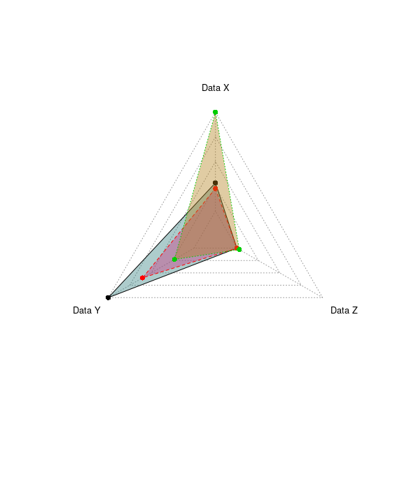
A radar chart is a graphical method of displaying multivariate data in the form of a two-dimensional chart of three or more quantitative variables represented on axes starting from the same point. This makes them useful for seeing which variables have similar values or if there are any outliers amongst each variable. Radar Charts are also useful for seeing which variables are scoring high or low within a dataset, making them ideal for displaying performance.
The radar chart is also known as web chart, spider chart, star chart,[1] star plot, cobweb chart, irregular polygon, polar chart, or Kiviat diagram.
install.packages("fmsb")
library("fmsb")
dd = data.frame(
    datax=dataX[(3:5)],
    datay=dataY[(3:5)],
    dataz=dataZ[(3:5)]
)
colnames(dd) = c("Data X", "Data Y", "Data Z")

maxRow = rep(max(dd), ncol(dd))
minRow = rep(min(dd), ncol(dd))
dd = rbind(maxRow, minRow, dd)

colorsRC = c(rgb(0.2,0.5,0.5,0.4), rgb(0.8,0.2,0.5,0.4), rgb(0.7,0.5,0.1,0.4))

# plot all data
radarchart(dd, vlcex=0.8, pfcol=colorsRC, cglcol="#999999")

# plot one data
radarchart(dd[(1:3),], vlcex=0.8, pfcol=colorsRC, cglcol="#999999")
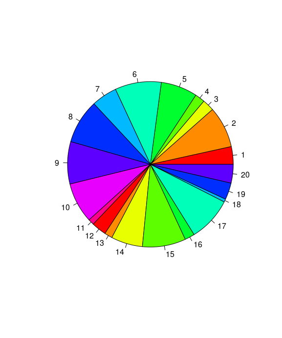
A pie-chart is a representation of values as slices of a circle with different colors. The slices are labeled and the numbers corresponding to each slice is also represented in the chart. Bar plots typically illustrate the same data but in a format that is simpler to comprehend for the viewer. As such, it's recommend avoiding pie charts if at all possible.
In R the pie chart is created using the pie() function which takes positive numbers as a vector input. The additional parameters are used to control labels, color, title etc.
pie(dataX, col=rainbow(length(x)))
Testing/viewing proportions
It is used when there is a need to display the proportion of contribution by one category to the overall level:
- Bubble chart
- Bubble map is useful for visualization of data points on a map.
- Stacked bar chart
- Word cloud
Relationship between variables
Association between two or more variables can be shown using the following charts:
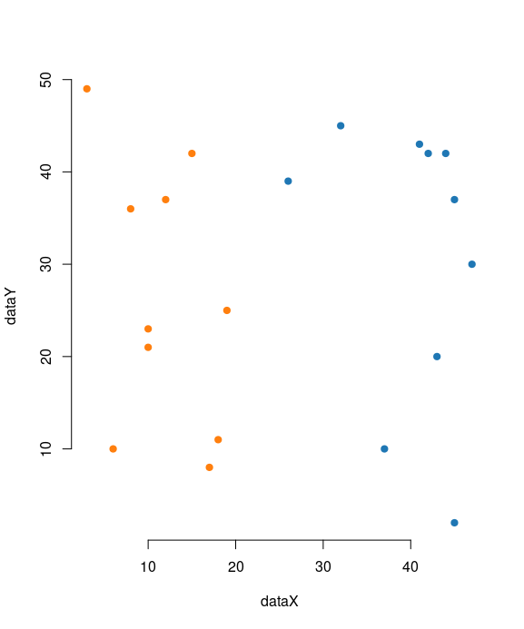
A scatter diagram examines the relationships between data collected for two different characteristics. Although the scatter diagram cannot determine the cause of such a relationship, it can show whether or not such a relationship exists, and if so, just how strong it is. The analysis produced by the scatter diagram is called Regression Analysis.
The data is displayed as a collection of points, each having the value of one variable determining the position on the horizontal axis and the value of the other variable determining the position on the vertical axis. A simple scatter plot can be created in R with the plot function.
plot(dataX, dataY, pch=19, axes=T, frame.plot=F, col=ifelse(dataX > 25, c1, c2))
- Bar chart
- Radar chart
- Line graph
- Tree diagram is simply a way of representing a sequence of events. Tree diagrams are particularly useful in probability since they record all possible outcomes in a clear and uncomplicated manner.
Variable hierarchy
When it is required to display the order in the variables, such as a sequence of variables, then the following charts are used:
- Tree diagram
- Tree map is similar to a pie chart in that it visually displays proportions by varying the area of a shape. A treemap has two useful advantages over a pie chart. First, you can display a lot more elements. In a pie chart, there is an upper-limit to the number of wedges that can be comfortably added to the circle. In a treemap, you can display hundreds, or thousands, of pieces of information. Secondly, a treemap allows you to arrange your data elements hierarchically. That is, you can group your proportions using categorical variables in your data.
Data with locations
When a dataset contains the geographic location of different cities, countries, and states names, or longitudes and latitudes, then the following charts can be used to display visualization:
- Bubble map
- Geo mapping
- Dot map
- Flow map
Contribution analysis or part-to-whole
When it is required to display constituents of a variable and contribution of each categorical level towards the overall variable, then the following charts are used:
- Pie chart
- Stacked bar chart
- Doughnut chart. Just like a pie chart, a doughnut chart shows the relationship of parts to a whole, but a doughnut chart can contain more than one data series. Each data series that you plot in a doughnut chart adds a ring to the chart. The first data series is displayed in the center of the chart. Doughnut charts display data in rings, where each ring represents a data series. If percentages are displayed in data labels, each ring will total 100%.
Statistical distribution
In order to understand the variation in a variable across different dimensions, represented by another categorical variable, the following charts are used:
Stem and leaf plot
A stem-and-leaf display is a device for presenting quantitative data in a graphical format, similar to a histogram, to assist in visualizing the shape of a distribution.
Unlike histograms, stem-and-leaf displays retain the original data to at least two significant digits, and put the data in order, thereby easing the move to order-based inference and non-parametric statistics.
A basic stem-and-leaf display contains two columns separated by a vertical line. The left column contains the stems and the right column contains the leaves.
A simple stem-and-leaf can be created in R with the stem function. stem produces a stem-and-leaf plot of the values in x. The parameter scale can be used to expand the scale of the plot.
stem(dataX)
Unseen patterns
For pattern recognition and relative importance of data points on different dimensions of a variable, the following charts are used:
- Bar chart
- Box plot
- Bubble chart
- Scatterplot
- Spiral plot are ideal for showing large data sets, usually to show trends over a large time period. The graph begins from the center of the spiral and progresses outwards. Spiral Plots are versatile and can use bars, lines or points to be displayed along the spiral path. This makes Spiral Plots great for displaying periodic patterns. Colour can be assigned to each period to break them up and to allow some comparison between each period. So for example, if we were to show data over a year, we could assign a colour for each month on the graph.
- Line chart
Spread of values or range
The following charts only give the spread of the data points across different bounds:
Textual data representation
This is a very interesting way of representing the textual data:
- Word cloud
Useful links
Quote
Categories
- Android
- AngularJS
- Databases
- Development
- Django
- iOS
- Java
- JavaScript
- LaTex
- Linux
- Meteor JS
- Python
- Science
Archive ↓
- September 2024
- December 2023
- November 2023
- October 2023
- March 2022
- February 2022
- January 2022
- July 2021
- June 2021
- May 2021
- April 2021
- August 2020
- July 2020
- May 2020
- April 2020
- March 2020
- February 2020
- January 2020
- December 2019
- November 2019
- October 2019
- September 2019
- August 2019
- July 2019
- February 2019
- January 2019
- December 2018
- November 2018
- August 2018
- July 2018
- June 2018
- May 2018
- April 2018
- March 2018
- February 2018
- January 2018
- December 2017
- November 2017
- October 2017
- September 2017
- August 2017
- July 2017
- June 2017
- May 2017
- April 2017
- March 2017
- February 2017
- January 2017
- December 2016
- November 2016
- October 2016
- September 2016
- August 2016
- July 2016
- June 2016
- May 2016
- April 2016
- March 2016
- February 2016
- January 2016
- December 2015
- November 2015
- October 2015
- September 2015
- August 2015
- July 2015
- June 2015
- February 2015
- January 2015
- December 2014
- November 2014
- October 2014
- September 2014
- August 2014
- July 2014
- June 2014
- May 2014
- April 2014
- March 2014
- February 2014
- January 2014
- December 2013
- November 2013
- October 2013